The Microsoft Lumia 640 Review
by Brandon Chester on June 9, 2015 8:00 AM EST- Posted in
- Smartphones
- Microsoft
- Mobile
- Lumia
- windows phone 8

The group that was once Nokia's mobile division has gone through a great number of changes in the past few years. After declining sales of Symbian devices, the company decided to go all in with Microsoft's Windows Phone platform. In a very short time, Nokia became the number one vendor of Windows Phone smartphones in the world. Despite this, the move to Windows Phone failed to revitalize the company. In August of last year, Microsoft purchased Nokia's mobile devices business in a 7.2 billion dollar acquisition. Less than a month later, Microsoft launched the Nokia Lumia 830, and the Nokia Lumia 735. These were the last two Lumia smartphones that would be branded as Nokia devices. With Nokia's phone division absorbed into Microsoft, future Lumia devices would fall under the Microsoft brand.
Today's review focuses on the Microsoft Lumia 640. This phone was announced alongside the Lumia 640 XL at MWC in February, and it's one of the first new Lumia devices released under the Microsoft brand. At $129, the Lumia 640 occupies a fairly low price point as far as smartphones are concerned, and it serves as an entry model to the Lumia smartphone line. To give a quick idea of what that $129 gets you in terms of hardware, I've organized the Lumia 640's specifications in the chart below.
| Microsoft Lumia 640 | ||||||
| SoC | Qualcomm Snapdragon 400 (MSM8926) 4x ARM Cortex A7 at 1.2 GHz Adreno 305 at 450 MHz |
|||||
| Memory and Storage | 1GB LPDDR3 RAM, 8GB NAND + MicroSDXC | |||||
| Display | 5.0" 1280x720 IPS LCD | |||||
| Cellular Connectivity | 2G / 3G / 4G LTE (Qualcomm MDM9x25 UE Category 4 LTE) | |||||
| Dimensions | 141.3 x 72.2 x 8.8 mm, 145g | |||||
| Cameras | 8MP Rear Facing w/ 1.12 µm pixels, 1/4" CMOS size, F/2.2, 28mm (35mm effective) 0.9MP Front Facing, F/2.4, 30mm (35mm effective) |
|||||
| Battery | 2500 mAh (9.5Wh) | |||||
| Other Connectivity | 802.11b/g/n + BT 4.0, GNSS, DLNA | |||||
| Operating System | Windows Phone 8.1 + Lumia Denim | |||||
| SIM | MicroSIM | |||||
| Price | $129 on Cricket Wireless | |||||
The Lumia 640's hardware is certainly above average in some areas. The first thing I noticed is that it ships with a 5" 1280x720 IPS display. This puts it significantly ahead of devices at the same price point which typically ship with qHD panels. 1280x720 devices show up closer to the $200 price bracket, and so the Lumia 640 is definitely ahead in this regard. The 1/4" 8MP camera is another spec that you wouldn't expect to see on a smartphone priced at around $100. While the camera sensor is hardly the only factor when it comes to final image quality, Lumia devices have traditionally had very good image processing, and so the Lumia 640's camera capabilities may end up far beyond those of the competition.
All the other specifications are fairly typical for a phone of this price. 8GB of NAND, 1GB of RAM, and 2.4GHz 802.11n WiFi are all you get at this price. There is one thing that disappoints me, and that's the SoC. Snapdragon 400 is fairly old by this point, and has been replaced by Snapdragon 410 for some time now. While the Moto E review showed that Snapdragon 410 isn't an enormous leap over Snapdragon 400, it certainly helps, and I wish Microsoft had used the Lumia 640 as an opportunity to start shipping ARMv8 devices.
Design
When the Lumia brand was originally introduced there were only two devices available. The first was the Lumia 710, and the second was the Lumia 800. I had always felt that the Lumia 710 was a fairly standard looking smartphone, but Lumia 800 had a unique type of industrial design. That design has since expanded with the introduction of models at different price points, and some of the physical characteristics that can be seen in the Lumia 640 are not the same as those in other Lumia devices like the Lumia 735.
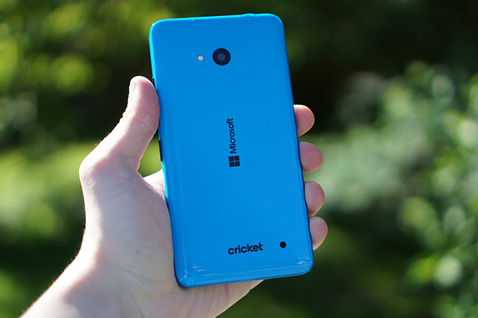
In a change from the order I typically follow when discussing the design of phones, the first part of the Lumia 640 I want to examine is actually the back cover. It’s a very solid feeling blue glossy plastic shell, although I would much prefer a matte finish, as the glossy plastic on this cover is already covered in scratches and smudges. The back cover has the Microsoft logo in the middle and in the case of this review unit a Cricket Wireless logo on the bottom. Next to the Cricket logo is a small hole to allow sound to pass through from the speaker underneath. Above the Microsoft logo is the 8MP rear-facing camera, and to the left of that is the LED flash.
What I find notable about this back cover is that although it’s removable, it feels incredibly solid and holds onto the phone very tightly. To put things in perspective, I actually questioned whether or not the back cover was removable when I first received the phone. Because there was no visible SIM slot I had to go online and confirm to myself that Cricket Wireless is not a Verizon or Sprint sub-brand running on EvDO and that there had to be a SIM slot somewhere. Only after I did this was I confident enough to pry off the back cover from the top of the phone.
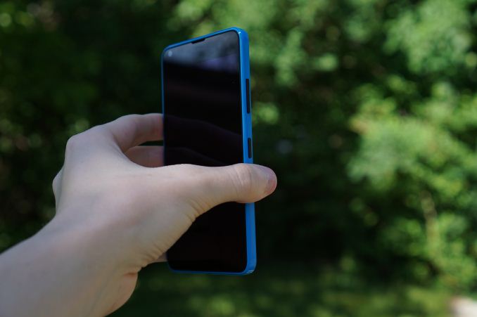
The left side of the Lumia 640 is completely bare, while the right side has both the power button and the volume rocker. I was actually surprised at how good the buttons felt. The last two phones I reviewed were the Moto E and the ZenFone 2, and they also had removable frames or shells with some of their buttons attached to them. Compared to them, the buttons on the Lumia 640 have a much nicer tactile response, and a longer travel distance.
One key difference between the Lumia 640 and some of Microsoft’s other Lumia devices is that it has flat sides and rounded corners. This contrasts with the traditional appearance of Lumia devices, which are flat on the top and bottom, but rounded on the left and right sides. The shape of those edges also meant that there was no way to have rounded corners even though the corners of the black face plate were rounded, which I felt created a unique appearance that made Lumia devices more distinct. The more standard flat edges and rounded corners of the Lumia 640 just aren’t as unique, and I wish it was more like a traditional Lumia phone.
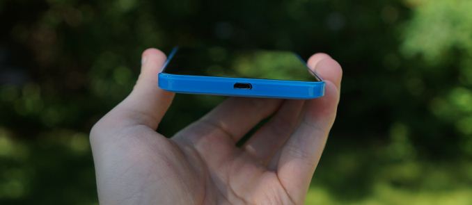
The top of the Lumia 640 has the 3.5mm audio jack, and the microUSB port is on the bottom. Something I noticed about my unit is that the actual port didn't line up perfectly with the hole that was cut in the plastic back shell of the phone. The hole was shifted slightly to the right, and the offset was just far enough to ensure that I could never get my charging cable to go in without jiggling the connector around until it found its way into the port. I assume that this is just a production mishap that is specific to my unit, but it's enough to cause a moment of frustration when trying to charge the phone or transfer files to it from a computer.
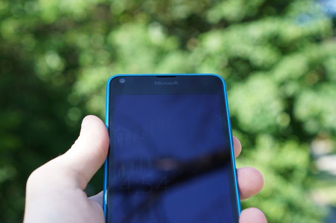
There’s not a whole lot to see on the front of the Lumia 640. It’s dominated by the 5” display, with only a handful of things positioned on the bezels around it. You may notice that you can see the touch array when light shines on the phone in a certain way. This is common on many phones, but it's a bit more noticable on the Lumia 640 than other devices. The bezel at the bottom of the display has a microphone to be used during calls, while the top has the front-facing camera and the earpiece speaker. Microsoft has seen fit to also put their logo on the top bezel, just in case you missed the logo right in the middle of the back cover.
My overall impression of the Lumia 640’s build quality and design is positive. While I’m not a fan of the glossy finish, the overall construction feels much more solid than any other phone at this price point that I’ve used.


130 Comments
View All Comments
WinterCharm - Tuesday, June 9, 2015 - link
That's a really nice phone for the price! :DGreat look and design, too!
JohanAnandtech - Tuesday, June 9, 2015 - link
That kind of performance is going to get frustrating pretty quickly. Simply using some kind of navigation will quickly show the limits of using an A7 core.Wolfpup - Tuesday, June 9, 2015 - link
On Android an A9 is dirt slow, while it's not bad running real Windows, much less Windows Phone.I've got a 520 and a 635, and the A7 isn't an issue in the 635 at all...at least not for the stuff most people do (certainly including navigation software). This 640 looks like an awesome extension...2x the RAM and a larger screen. Naturally it's coming out not long after I bought a spare 635 lol
jospoortvliet - Thursday, June 11, 2015 - link
As the review makes clear - Windows Phone lost its advantages in terms of performance...jakoh - Thursday, June 11, 2015 - link
The review compares the 640 to a bunch of high spec'd android and IOS, it doesnt show that WP can run smoothly even on crappy specs.leexgx - Thursday, June 11, 2015 - link
i do agree i got a nokia 820 seems to work wellBut the Main problem with windows phones is lack of ram some times background tabs are deep suspended and take to long to restore i ignore any windows phone with 512mb of ram but would recommend 2GB as a minimum
darkich - Friday, June 12, 2015 - link
You clearly didn't even read the article.The author was specifically comparing this to low end Motorola moto E performance wise.
And he stated for several times that the whole OS and browser feel really slow in comparison.
SirPerro - Monday, June 15, 2015 - link
"I mentioned in my Moto E review that for a long time I recommended that users who wanted a cheaper smartphone go with Windows Phone over Android, because at the time the options on Android were janky, slow, and offered a poor experience. I can’t make that recommendation anymore, because the app gap is still here, while the experience gap in favor of Windows Phone is gone."Article is loud and clear
Murloc - Tuesday, June 9, 2015 - link
not really, I have a 635 and the experience is fluid.testbug00 - Tuesday, June 9, 2015 - link
Really? L520 running quite smoothly through everything I throw at it (web browsing, some music playing, few notes in OneNote) andf it's a dual core A7 chipset (SD200)./yawn