The Samsung Galaxy S6 and S6 edge Review
by Joshua Ho on April 17, 2015 9:00 AM EST- Posted in
- Smartphones
- Samsung
- Mobile
- Galaxy S6
- Galaxy S6 Edge
As recently as the Galaxy S5, Samsung had a fundamentally different strategy from companies like HTC and Apple. While design wasn’t ignored completely, Samsung Mobile had a different set of priorities. In general, it felt like Samsung wanted the phone to have every feature possible to please every possible potential customer. Features like a removable battery and microSD card slot seemed to be a crucial point of differentiation. TouchWiz focused on delivering a full suite of applications even if they were pretty much redundant when compared to Google’s applications. Samsung also seemed to cost-optimize their external shells, favoring polymer builds over glass or aluminum. Since the Galaxy S, this strategy paid off handsomely. With the help of strong marketing, Samsung proceeded to dominate the Android market from the days of the Galaxy S2, to the point that almost no other Android OEM was relevant in terms of market share.
However, Samsung’s tried and true strategy failed with the Galaxy S5. Fundamentally, Samsung had always been competing with Apple and their iPhone line-up at the high end, but Samsung consistently held a price advantage. The real problem was the rise of low-cost flagship phones, which squeezed Samsung significantly. Other OEMs were able to justify their high-end pricing by delivering a polished software experience and premium hardware design. In comparison to these relatively cheap phones which delivered largely the same experience and hardware, Samsung’s sales crumbled and the Galaxy S5 didn’t meet sales expectations.
This brings us to the Galaxy S6, which is supposed to be Samsung’s attempt at refocusing their product design and lineup. Design has become a major priority, and the Galaxy S6 is a radical departure from previous design in terms of almost every design choice. The Galaxy S6 represents the best that Samsung can make to some extent, as a great deal of the phone is composed of Samsung-made parts to achieve maximum vertical integration as seen in the specs below.
| Samsung Galaxy S5 | Samsung Galaxy S6 | Samsung Galaxy S6 Edge | |
| SoC | MSM8974ACv3 2.45 GHz Snapdragon 801 | Exynos 7420 2.1/1.5GHz A57/A53 | Exynos 7420 2.1/1.5GHz A57/A53 |
| RAM | 2GB LPDDR3 | 3GB LPDDR4-1552 | 3GB LPDDR4-1552 |
| NAND | 16/32GB NAND + microSD | 32/64/128GB NAND | 32/64/128GB NAND |
| Display | 5.1” 1080p SAMOLED HD |
5.1” 1440p SAMOLED |
5.1” 1440p SAMOLED, Dual Edge |
| Network | 2G / 3G / 4G LTE (Qualcomm MDM9x25 UE Category 4 LTE) | 2G / 3G / 4G LTE (Category 6 LTE) | 2G / 3G / 4G LTE (Category 6 LTE) |
| Dimensions | 142 x 72.5 x 8.1 mm, 145 grams | 143.4 x 70.5 x 6.8mm max, 138 grams | 142.1 x 70.1 x 7.0mm max, 132 grams |
| Camera | 16MP (5132 x 2988) Rear Facing with 1.12 µm pixels, 1/2.6" CMOS size, 31 mm (35mm effective), f/2.2 | 16MP (5132 x 2988) Rear Facing w/ OIS, f/1.9, object tracking AF | 16MP (5132 x 2988) Rear Facing w/ OIS, f/1.9, object tracking AF |
| 2MP Front Facing | 5MP Front Facing, f/1.9 | 5MP Front Facing, f/1.9 | |
| Battery | 2800 mAh (10.78 Whr) | 2550 mAh (9.81 Whr) | 2600 mAh (10.01 Whr) |
| OS | Android 4.4 w/TouchWiz |
Android 5 (64-bit) w/TouchWiz | Android 5 (64-bit) w/TouchWiz |
| Connectivity | 802.11a/b/g/n/ac 2x2 + BT 4.0 (BCM4354), USB3.0, GPS/GNSS, MHL, DLNA, NFC |
2x2 802.11a/b/g/n/ac + BT 4.1 (BCM4358), USB2.0, GPS/GNSS, NFC |
2x2 802.11a/b/g/n/ac + BT 4.1 (BCM4358), USB2.0, GPS/GNSS, NFC |
| Wireless Charging | N/A | WPC 1.1 (4.6W) & PMA 1.0 (4.2W) |
WPC 1.1 (4.6W) & PMA 1.0 (4.2W) |
| Fingerprint Sensor | Swipe | Touch | Touch |
| SIM Size | MicroSIM | NanoSIM |
NanoSIM |
Design
There’s a lot of ground to cover in the Galaxy S6 and S6 edge, but probably the most immediate change is to the design. The Galaxy S6 is a unibody design, with no apparent screws. This does mean that there’s no removable battery or microSD slot, which shouldn’t be a problem for most people although this may be enough for some to write off this phone completely.
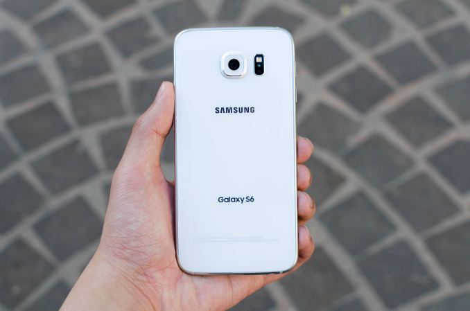
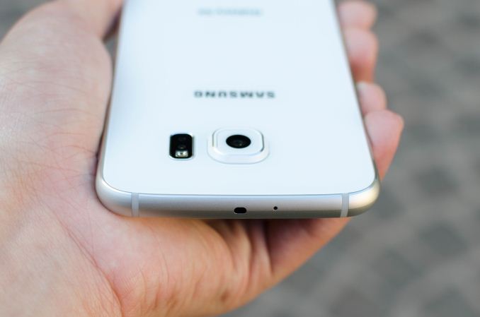
The back cover is now glass instead of plastic, and is attached to the phone with glue instead of plastic latches. Regardless of color or model, Samsung has placed an extremely fine pattern beneath the glass that manages to be subtle but also surprisingly brilliant under direct light. It’s tasteful in a way that the Galaxy S5 and Note 4 weren’t. The back of the phone also has a single LED flash, a heart rate monitor, and the camera which bulges out significantly. I personally don’t have a problem with camera humps, but the Galaxy S6’s camera hump is probably the biggest I’ve seen in recent memory.
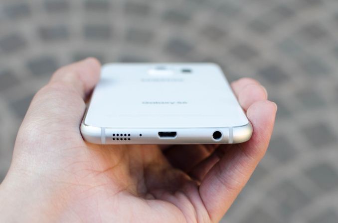
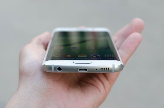
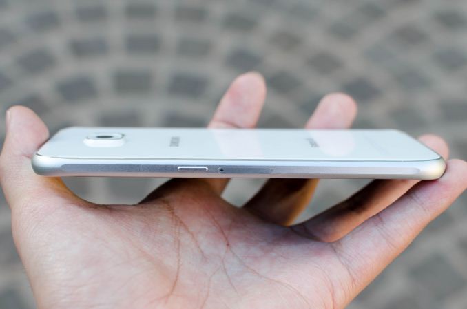
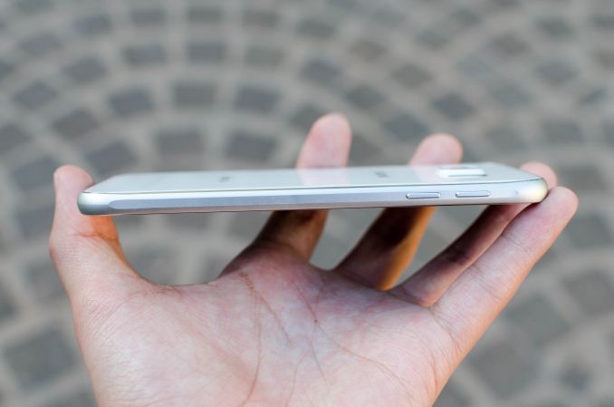
The glass back cover meets the metal frame of the phone, which provides most of the structural rigidity and strength. On the normal Galaxy S6, this frame has a very slight curve and is almost cylindrical along the top and bottom of the phone, but flattens out along the sides for better grip. The bottom of this frame has the speaker, microUSB port, and 3.5mm headphone jack, which does make for some resemblance with Apple products launched within the last year. At any rate, the placement of the speaker, USB port, and 3.5mm jack are all appropriate for a phone.
The left side of the frame contains the volume buttons, which are clicky and solid, although pressing the buttons off-center does produce a noticeable flex. The right side of the frame has the power button and the nanoSIM slot on the normal version.
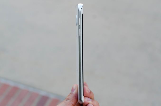
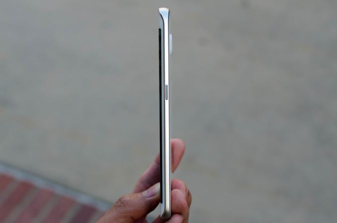
On the edge variant, the sides of the frame are dramatically thinner and appear to be angled out when compared to the Galaxy S6. In the hand, this makes it feel much thinner than the S6, but it really feels almost too thin to hold comfortably. Combined with the flat back, it’s really a bit of a struggle to pick up the edge off of a table, which compromises usability when compared to the normal S6.
The top of the frame contains the IR LED for TV capabilities and a hole for a microphone. On the edge variant, the nanoSIM slot is relocated to the top of the phone.
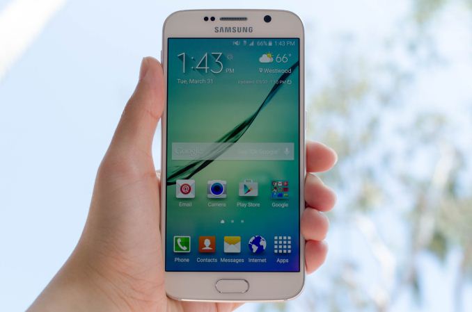
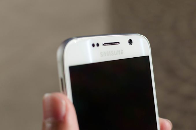
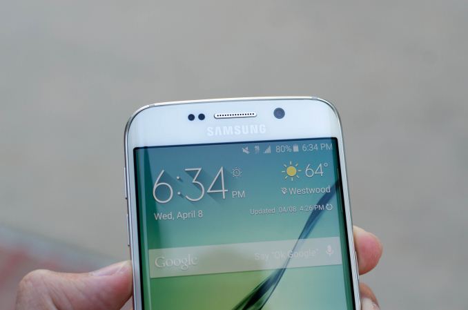
The front of the phone is probably the only aspect of the design that feels relatively similar to the Galaxy S5. However, the texture of the bezel beneath the glass is similar to the subtle finish of the back cover, which makes for a unique visual effect that manages to be tasteful and quite unique. Other than this, we see the same layout as most Galaxy phones, with two capacitive buttons (multitasking on the left, back button on the right) and a physical home button. In the case of the Galaxy S6, this home button has been turned into a fingerprint scanner that is touch-based rather than a swipe sensor. Along the top of the front face, we also see the ambient light sensor, a proximity sensor, the earpiece, and the 5MP front-facing camera. Directly below these items is the display driver beneath the bezel, which is similar to the “logo bar” of the One M7, M8, and every other phone on the market today. On the S6 edge, the sides of the display are curved to reduce the width of the phone, which does make it easier to hold in the hand, but there’s really no bezel reduction here as the side bezels seem to be larger than what we see on the S6.
Overall, the design of the Galaxy S6 and S6 edge is really unlike anything else they’ve produced in recent memory. The phone itself is well-sized and feels much more ergonomic than the Galaxy S5 due to the thinner build and mildly reduced bezel size. It really feels like Samsung cared about the design of the phone this generation, and the attention to detail here immediately puts Samsung near the top in this area. The front of the phone still feels a bit derivative, but I suspect that there isn’t much Samsung can do to change this when faced with design constraints like a physical home button. The S6 edge does look better in some ways, but ergonomically the sharper and thinner edge is a compromise compared to the normal S6. Either phone is still easily one of the best-designed phones I’ve seen this year.




306 Comments
View All Comments
Inteli - Friday, April 17, 2015 - link
While no removable battery is workable (if disappointing), I dislike the removal of the SD Card slot in favor of being more iPhone-like, since it allows for more storage (and I don't have to worry about clearing stuff out for updates). Hopefully Samsung won't go this way with the Note 4, or else that might very well be my last Samsung phone.Inteli - Friday, April 17, 2015 - link
And by Note 4, I meant Note 5.Vandam500 - Friday, April 17, 2015 - link
I doubt it man. The Note 5 will likely be very similar to the GS6 which means no removable battery and no microSD card slot.mindracer - Friday, April 17, 2015 - link
I have a feeling Samsung will keep the Note series as it's "productivity/business class", be like the GS6 but with removable storage and battery, and make the GN5 the top of the line in design and features for the real heavy user.Solandri - Friday, April 17, 2015 - link
What I don't get is, Samsung makes like two dozen different smartphones. Why can't they make two top-tier phones - one with the "everything sealed" philosophy and another with the "user can replace the battery and microSD card" philosophy, both using the same screen, processor, camera, etc.?lyricalsaint - Friday, April 17, 2015 - link
Probably because Apple has been so successful with marketing theory, and Samsung wants to copy their concept of giving consumers limited choices. Too many choices can put people into somewhat of a decision paralysis.Gigaplex - Friday, April 17, 2015 - link
But it's too late for that, Samsung already has too many choices.joos2000 - Saturday, April 18, 2015 - link
It isn't hard to cut models to reduce choice really. They can slim down their product line in months.MacDaddy100 - Friday, April 24, 2015 - link
It's not a marketing theory, its not many people give a rats a$$ about removable batteries and upgrade memory cards, I plug my phone in at night like 99% of the people do, I have 128gb of internal memory that hold my 10K (High Bit Rate) song library with room left over that very few people even want to do with Pandora and such that don't need the internal memory. Quit living in the 90s, everything thing is online, or in the cloud now.peterfares - Saturday, April 25, 2015 - link
So then why didn't you just get the 32GB model?