Windows 10 Fall Creators Update Coming October 17
by Brett Howse on September 1, 2017 8:30 AM EST
This morning at IFA in Berlin, Terry Myerson, EVP of the Windows and Devices Group at Microsoft, announced that the next Windows 10 update will be launched worldwide on October 17. Dubbed the Fall Creators Update, it’s the first such update since the Creators Update debuted in the spring, and with this update, Microsoft will officially begin their bi-annual update cadence. The Fall Creators Update was first announced at Microsoft’s developer conference, Build. It, like the other updates to Windows 10 preceding it, continues the evolution of Windows 10, bringing some new features to the table, and updating the underlying platform with new capabilities.
This will be the fourth major update to Windows 10 since it launched in July of 2015, and with the benefit of time, it’s easy to forget the dramatic changes it brought, merging the touch-first design of Windows 8, with the desktop happy Windows 7, into a very capable, and flexible platform. Windows 10 brought some major changes, and most notably was the move to a continuous servicing model, which is the underlying basis for these bi-annual updates. The original servicing model was a lot more fluid, and with the traction of Windows in the enterprise market, Microsoft needed to offer a model that could be planned for, which they now have. You could easily argue that this model of twice a year updates to Windows 10 is too fast for the enterprise, and I would not disagree, but having a plan is better than the random updates seen prior to this.
There’s quite a bit coming to the Fall Creators Update, despite the name being only one word different than the Creators Update it is superseding. Not all of the features announced at Build have ended up making it in, which is likely the trade-off of moving to a rigid release schedule, but the majority are. It’s also interesting to note that Microsoft has, for some time, been able to update portions of Windows 10 without these larger feature updates, but has more or less chosen the stance of not doing that, perhaps in an effort to beef up the content of each update, but one of the main features announced at Build has already started to creep into the current version of Windows, and that is the Fluent Design.
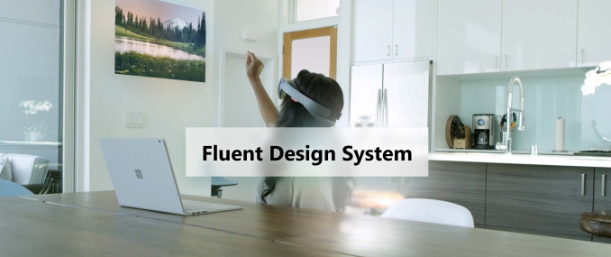
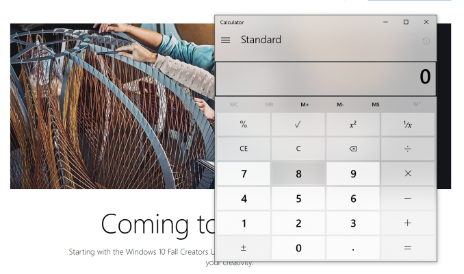
For a full recap of Fluent Design, check out our coverage from Build, but it’s a new design language for Windows 10 which takes us further away from the extreme flat look of Windows 8, and brings about effects with lighting and transparency which both look great, and add functionality. Lighting and movement are going to be key elements now, bringing contrast and context to buttons and more. Some apps have already been updated with Fluent Design, such as the calculator on the current version of Windows, and the contemporary design looks great.
Windows Ink is getting some more love, as it tends to with each update. Microsoft loves the digital pen, and that plays out in both their software and hardware developments. Windows 10 is finally going to let you ink right onto PDFs in the Fall Creators Update, which should please many. There’s now a Find my Pen feature built into Windows, and while pens don’t have GPS built-in for perfect tracking, Windows will be able to tell you where it last was connected to your pen, which should help those of us who can’t seem to keep track of them. Inking is also gaining more AI capabilities to automatically make items into what you’re attempting to create, such as turning boxes into a table.
Photos is getting new features added to let you remix your photos, videos, music, and more, into stories. Luckily, Photos is still going to be called Photos though, so you should still be able to find your pictures even though there will be additional capabilities added to the app.
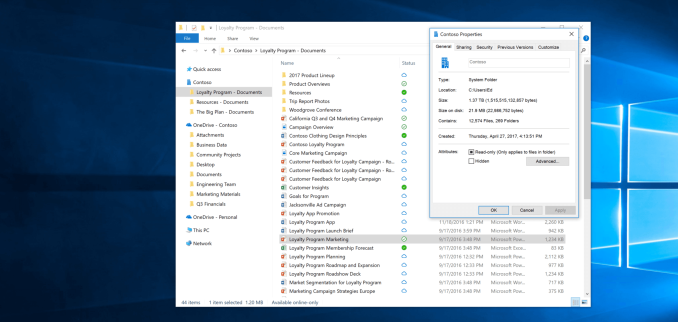
The one feature I am looking forward to more than any other is easily OneDrive Files On-Demand. Finally, we’ll be able to see our entire OneDrive in Windows Explorer without having to download it first, and because modern PCs have limited storage thanks to solid state drives, the on-demand files don’t take up any space on your system unless you need them. This feature originally existed in Windows 8.1, but underlying issues with the solution at that time could lead to apps throwing errors, because they weren’t aware of this feature. With it now being built into the file system of Windows, that should hopefully be avoided. The only issue people will run into is if they forget to download the file they need before going offline, and we’ll see if the file graphics added will be enough to make it obvious.
Another feature coming is the ability to automatically delete files from your Download folder over time. As someone who tends to download and forget, this could be very helpful in keeping my drive clean.
Eye control is also coming to Windows 10, which should be a great help making Windows 10 more accessible to those that can’t operate a mouse, or use touch. The ability to control the mouse with your eyes is the next step on Microsoft’s path to making Windows 10 more accessible to all.
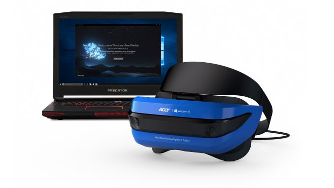
Windows Mixed Reality is also coming as part of the update, and several OEMs such as Acer, Dell, HP, and Lenovo, will all have mixed reality headsets available when the Fall Creators Update ships. The push for VR seemed to be a very strong want from everyone, until it arrived and very few bought in, but we’ll see how these lower priced mixed reality headsets do before passing judgement.
There’s plenty of other features coming as well, such as improved HDR and wide color gamut support, advances in the Windows Subsystem for Linux, and security enhancements as well. The Windows Store is going to be adding more desktop apps using the Desktop App Converter, formerly known as Project Centennial. iTunes, as an example, is supposed to be coming to the Windows Store via this desktop bridge, and many other big-name apps as well. Microsoft never got the buy-in they wanted or needed with UWP, but this is a good step to at least get the apps everyone knows and needs available on the store, and then they can go from there. This is especially important thanks to Windows 10 S, which only allows app installs via the store.
There’s more to come later as well. Almost a year ago, Microsoft and Qualcomm came together to announce new PCs running on Qualcomm CPUs, meaning Windows 10 is going to be available on ARM, with x86 emulation. Intel isn’t too happy about this though, as they mentioned in an earnings call, but we should be seeing some of these devices soon, since they are supposed to be available in the second half of 2017.
We’ll look into some of these Windows 10 features with a more in-depth look when they features are available to all, so stay tuned.
Source: Microsoft




75 Comments
View All Comments
Flunk - Friday, September 1, 2017 - link
Here's hoping they add the option to turn the transparency off if you don't like it. I don't really see the point to it, it just makes text harder to read. If they restricted it's use to only panels that didn't contain text, or the text was on a solid element on top of it it would also eliminate my complaint about it.For an example of what I mean look at the left-hand menu in Groove Music, that shouldn't be transparent, with a dark background image it becomes nearly unreadable.
Flunk - Friday, September 1, 2017 - link
Before anyone comments about this, I know you can turn transparency off system-wide, I just want it off in the "acrylic" panels used by fluent design, not everywhere.quiksilvr - Friday, September 1, 2017 - link
Right click Start Icon on the bottom left --> Settings --> Personalization --> Colors --> Transparency Effects.For system-wide:
Right click Start Icon on the bottom left --> System --> System Info on the top right for Creators update, otherwise skip to --> Advanced System Settings on the left --> Advanced Tab --> Settings --> Visual Effects tab --> Uncheck Show translucent selection rectangle
quiksilvr - Friday, September 1, 2017 - link
Advanced Tab --> Settings under "Performance" --> Visual Effects...quiksilvr - Friday, September 1, 2017 - link
Actually it seems like the Transparency Effects is system wide now. Terrific so it appears to be all or nothing.jabber - Friday, September 1, 2017 - link
Will they have Control Panel/Settings sorted out once and for all? I'm still 80/20 Control panel.Wolfpup - Friday, September 1, 2017 - link
That whole situation is bizarre. I'm not sure I WANT it to change given that may mean they remove features or make them hardware to access.Alexvrb - Friday, September 1, 2017 - link
Hardware to access? Like... a control board loaded with toggle switches? Sweeeeeet!Ascaris - Monday, September 4, 2017 - link
They should keep them both, and restore all functionality lost in the Control Panel since Windows 8. It was a good design that has withstood the test of time... the design easily allows hardware and software manufacturers to extend the function of the Control Panel by adding their own .cpl objects. Every Linux desktop environment I have seen so far has some variation on a copy of the Windows Control Panel. When you get something right, there's no need to further improve it; if you try, you just make it worse. Case in point: the ribbon.I don't care that the Control Panel isn't "touchy" enough. Few people use Windows with touch, and even fewer ONLY with touch. The ship has sailed on Windows Phone, and MS itself has demonstrated that it has resigned itself to this fact when it released apps for iOS and Android that were not then available on its own Windows mobile platform. Leave the touch/UWP interface for those devices that are touch enabled, and leave the mouse-oriented traditional UI for the rest of us.
The actual widgets to build a Win32 or a UWP UI for any given program (or Windows component) are already in Windows 10. The code to utilize those widgets and make an actual UI is trivially small compared to the size of even a simple standalone program these days. Having two predefined, distinct UIs in each program or component wouldn't be "reactive" and thus trendy cool, but it would be something even better: A decently usable, consistent, platform-appropriate UI.
Microsoft's efforts at a single UI to cover everything have fallen way short. Two years after the release of 10 and five since the release of 8, it's still a "zebra" UI in Microsoft's own terms. Canonical has given up on their efforts to accomplish the same thing with Unity. It's one of those ideas that sounds neat on paper but doesn't really work as well as anyone had hoped in the real world. Can we just cut the losses and develop the two UIs in parallel, with each being feature complete and independent of the other?
If MS did that with 10, and at the same time stopped trying to exert so much control over the customer's PC (definitive off switches for telemetry, forced updates, all present and future ads, UWP, and the ability to uninstall Cortana and every app), they might just have themselves an OS there. It would still suffer from insufficient testing (no, we consumer level users are not beta testers) and a needlessly fast update schedule. It's an OS; its job is to be stable and run other programs. Leave the bells and whistles to those other programs, but let the OS itself be stable, without constant code churn.
I'm dreaming, I know.
djscrew - Friday, September 8, 2017 - link
This should be top comment. Like, why does .msc configurations exist still? Move them into the new UI. Simplify the UI but don't eliminate options.