The Nexus 6 Review
by Brandon Chester on November 12, 2014 1:00 PM ESTSoftware
The software on a smartphone is ultimately what defines whether or not it provides a good experience. Good hardware cannot save a device with poor software. The Nexus 6 comes with Google's latest iteration of Android, version 5.0 Lollipop. This is by far the biggest update the OS has seen in quite some time, with the last major visual overhaul occurring in 2011 with Android Ice Cream Sandwich. I plan to do a more in-depth look at Android Lollipop itself, but I do have some impressions of the operating system on the Nexus 6 specifically, as well as how it compares to Android Lollipop running on the Nexus 5. The most important question to answer about the software experience on the Nexus 6 is how well it takes advantage of the large display.
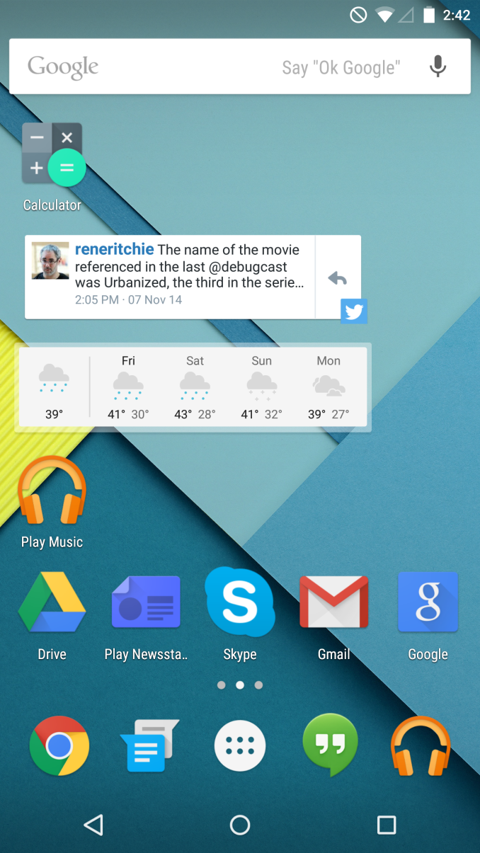
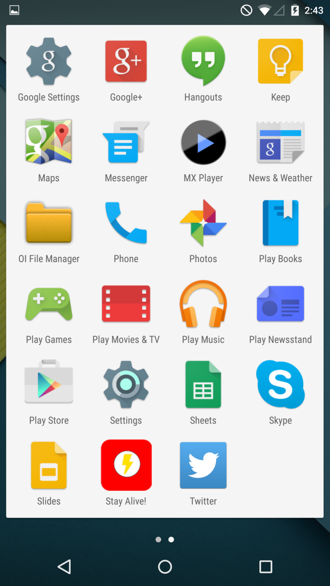
The most obvious starting point to look at is the launcher. While there are some visual changes from Android 4.4, the Google Now launcher is effectively the same in Android 5.0 as it was in 4.4 with regards to functionality. On the Nexus 6 it takes advantage of the larger display by adopting a 5x5 layout for applications and widgets on the home screens, and a 6x4 layout in the application drawer. The decision to only allow for four columns in the drawer seems to be more of an aesthetic one rather than a functional one, as it puts a greater amount of horizontal space between each icon. Google's decision to use a 5x5 layout on the home screen allows for a greater number of icons and widgets to be placed, but it also causes issues with many widgets that are non-resizeable and are fit to the typical 4 column width. This is something that will be fixed as time goes on and developers update their applications, and I support Google's decision to create some minor visual issues by allowing for more home screen space instead of simply making everything larger.
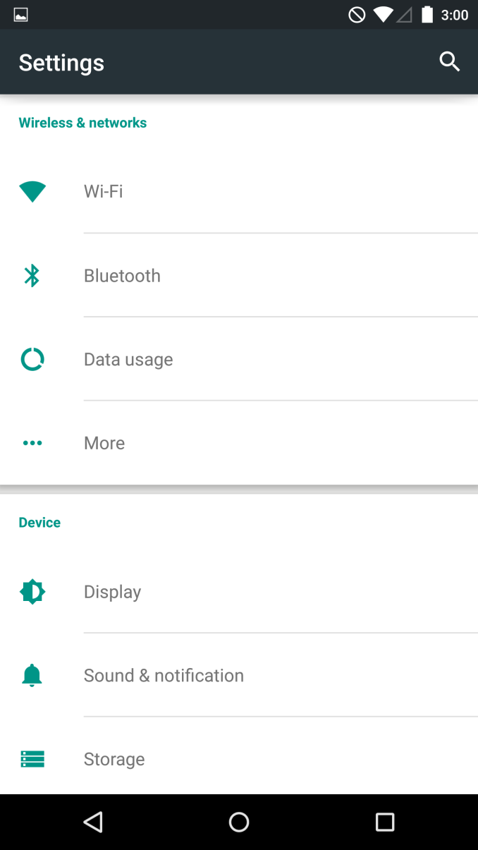
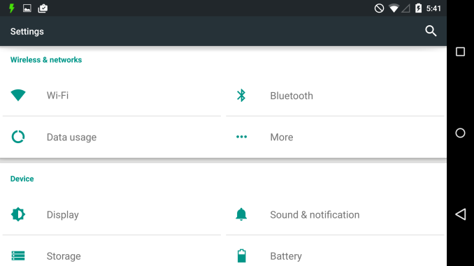
Unfortunately, some parts of Android Lollipop have a surprisingly low information density and this is made even more obvious on the large display. The main section of the Settings application is a particularly good example of this. As you can see above, even with the font size set to small there is a gratuitous amount of spacing between each label and the borders above and below it, which means that you are able to view far fewer sections on the screen at a single time. Fortunately this doesn't apply to the other parts of the application, but that also makes it seem inconsistently designed.
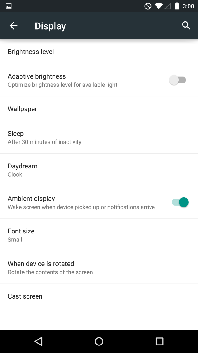
Above you can also see the toggle for Ambient display. This is a similar feature to Moto Display on the Moto X, where the display will turn on whenever a notification arrives or the phone is picked up. When this occurs, the lock screen is dimmer, with a black background and white used sparingly to conserve power. Thankfully, the extremely low display power consumption when this feature is in use means that it has no significant negative impact to battery life, and may actually improve it overall by eliminating the need to ramp up the CPU frequency and turn on the display fully whenever a notification arrives.
Providing a good video experience is something the Nexus 6 should excel at due to its massive display. Something that surprised me is that Google still has no actual video player application for Android, relying on playback through the photos application which has limited format support to say the least. At one time in the past the Play Movies & TV application had the ability to play videos stored locally, but now even that has been removed. To make matters worse, the version of MX Player on Google Play is incompatible with Android Lollipop and will not run. In my opinion, MX Player is the best video player on any mobile platform and not being able to test it would have been a great shame. Luckily, there is a version on the web which has been updated to run on Android Lollipop.
After finding a video player and sorting through any potential compatibility issues with the new OS, the video playback experience on the Nexus 6 is great in most cases. The contrast ratio of AMOLED displays makes some films look absolutely incredible, and the display calibration tends to not have a massive impact on live-action content. Animated content tends to use brighter and more highly saturated colors than what commonly appear in the real world, and so the over saturation does have a noticeable impact on how that looks on the Nexus 6 compared to a reference display. In terms of format support, it seems that video players don't yet have support for Qualcomm's HEVC decoder built into Snapdragon 805, and so any 1080p or 4K content encoded in High 10 Profile H.264 or HEVC brought the device to its knees. These are still fairly uncommon formats, and I doubt this will impact the experience for most users.
A good way to take advantage of a large display is by having special layouts in landscape mode. Apple did this with their iPhone 6 Plus by adding landscape support to Springboard, and by implementing dual-pane views in applications when displayed in landscape orientation. Samsung has also done this with some of their Touchwiz applications on the Galaxy Note 4. Unfortunately, Android Lollipop doesn't really have any special layouts made for the Nexus 6. While there are a couple of applications like Settings and Calculator that now have improved landscape views, these are perfectly usable on smaller devices like the Nexus 5 and are not unique to the Nexus 6. This makes it difficult to justify the sacrifice of one-handed usability to have such a large display, because the benefits are limited to just displaying a few more lines in Chrome or another row of icons. Google has obviously had to dedicate a lot of engineering resources to just getting Android Lollipop out the door, so it's possible that we'll see updates to enhance software on the Nexus 6, but as it is right now I'm wondering if Google possibly aimed a bit too high with the 5.96" screen size.
One last thing I would like to touch on is the performance of Android Lollipop on the Nexus 6. In this context, performance refers to the framerate of animations and any times where there are significant frame drops or freezes, which are commonly referred to as "jank". I am somewhat concerned because the Android Lollipop experience seems to have some areas with constantly low framerates or stuttering on the Nexus 6, despite all the promotion about the improved performance brought about by software optimization and the new ART runtime. However, what makes these issues interesting is that some of them do not exist on the Nexus 5 running the Android Lollipop preview, and I do not know the reason why. For the most part the experience is extremely smooth, smoother than Android has ever been. But certain applications like Calendar, Messages, and the notorious Google Play have animations that either frequently drop to 0fps which causes a visible stutter, or run not just below 60fps, but below 30fps, causing a sluggish animation. I am hopeful that these issues can be fixed with future software updates, but it's certainly surprising and concerning to see areas where the new device does not perform as well than the old one.




136 Comments
View All Comments
Muyoso - Wednesday, November 12, 2014 - link
Go ahead and tell me again why the $649 pricetag is justified because this is the "no compromises" Nexus we have been waiting for. . . . . . .Affectionate-Bed-980 - Wednesday, November 12, 2014 - link
In come the Nexus apologists that say this is a developer's phone!I say this as someone who's owned 4 Nexus phones and have been disappointed in battery and camera each time.
Muyoso - Wednesday, November 12, 2014 - link
The thing is, with prior Nexus phones, the battery and camera shortcomings could be justified because of the price. At $649, Google has to be high. Aluminum trim ain't that special.dishayu - Wednesday, November 12, 2014 - link
It's a fair price for the device. It's not cheap for US Americans because your retarded mobile carriers. For the rest of the world, where BYOD plans are without contract and dirt cheap, the phone is priced very competitively. It's cheaper than a Galaxy S5, HTC One M8 and LG G3 where I live.Frenetic Pony - Thursday, November 13, 2014 - link
Ouch, really? Just googled a G3, unlocked its $450 here. Ahh international markets, exchange rates and etc. Will you ever make things sensible?dishayu - Thursday, November 13, 2014 - link
The prices of the G3 have indeed dropped considerably but the nexus 6 is still priced at par with competition. Just checked Clove.co.uk and here are the prices :HTC One M8 : 499 GBP
Note 4 : 575 GBP
Xperia Z3 : 515 GBP
Nexus 6 32GB : 499 GBP (play store)
ws3 - Thursday, November 13, 2014 - link
That's all beside the point. Previous Nexus phones were priced considerably below the off-contract price of other phones with similar specs. This one isn't. That is the only claim being made.Acreo Aeneas - Sunday, November 23, 2014 - link
Maybe you should reread the article. Other than a few previous Nexus phones, the rest were about on pay pricing wise with the mainstream competition.Delfang - Thursday, November 13, 2014 - link
The fact that Z3 is available for 450 GBP on Amazon make your point invalid.garretelder - Thursday, December 4, 2014 - link
I'm personally not very impressed with the Nexus 6 (and neither is rankings like http://www.topreport.org/phones/ for example).