Eurocom Monster 1.0: Clevo's Little Monster
by Vivek Gowri on May 18, 2012 4:55 AM EST- Posted in
- Laptops
- Clevo
- Eurocom
- Ivy Bridge
- Kepler
Everything But the Kitchen Sink?
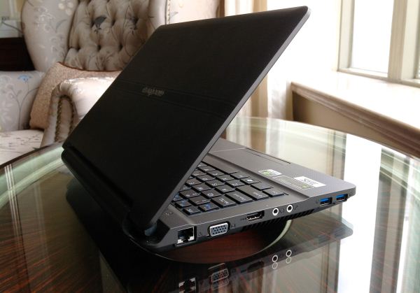
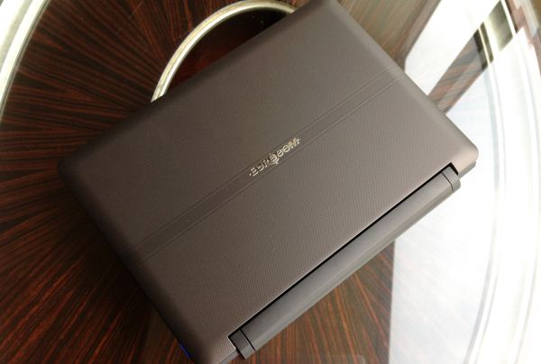
While the internal hardware is basically second to none, I have mixed feelings about the Monster from a device hardware standpoint. Clevo has never been mistaken for a design powerhouse, and the Monster does nothing to change that. Like most other Clevo notebooks, the design is a bit staid. It’s inoffensive, but relatively boring. The word that comes to mind is generic. In stark contrast to the heavily design-centric ultrabooks coming out these days, it’s a bit jarring. Obviously, the form factor isn’t conducive to a sleek and beautiful design, but even so, there aren’t any distinguishing characteristics to the design in general.
The chassis is constructed primarily of plastic, with a rubberized soft-touch finish on the interior and lid. There’s a square patterning on the palmrest, touchpad, and lid, giving all the surfaces you touch a subtle texture that feels nice to the touch. It feels pretty solid, no creaks or anything of the sort, and the lid is pretty resistant to torsion. It’s a pretty chunky laptop, and it’s built to match. I wouldn’t necessarily say it’s rugged or tough in the same way as a ThinkPad, but this is a notebook that can take some abuse, something you can toss around without being afraid of scratching or denting.
From a form factor standpoint, the Monster is pretty interestingly situated. It has a smaller footprint than the M11x (the W110ER comes in at a quarter of an inch wider but almost an inch less deep), though a little bit thicker. The LCD bezel is thankfully not nearly as large or as distracting as the one on the M11x, but a major complaint we had with the smallest Alienware was that it had a chassis large enough to accommodate a bigger screen; that holds true for the W110ER as well. While a 13.3” screen would have required too many dimensional changes to fit (unlike the M11x, which already had the depth to fit a 13” screen), a 12.5” screen could easily fit within a slightly widened chassis (see the 12.5” Samsung Series 3 or ThinkPad X220 at 11.75” and 12.0” wide, respectively). The 1.8kg/3.95lb weight is roughly where one would expect, heavier than Sony’s 13” SA-series but a half pound lighter than the outgoing M11x R3. Considering the computing prowess on tap here, the weight and thickness are small sacrifices to make. Still, it would be nice if the next person to make a notebook in this vein would drop the pretense of a gaming 11.6” ‘ultraportable’ and spec a screen that fit the chassis better.
The thickness actually makes a surprising difference. There’s a steep taper near the front of the notebook that allows Eurocom to quote 0.51” at thinnest point, but it’s basically 1.25-1.5” thick through most of the body. Hilariously, it’s more than twice as thick as the ASUS Zenbook UX21. Compared to ultrabooks and even newer non-ultrabook thin and lights, this feels like a notebook from a different era. Specifically, it reminds me a lot of the 12-13” notebooks from around five years ago—Dell’s XPS M1210, the ASUS W5F and W7J/W7S (a notebook that I have a lot of affection for), even the Lenovo V100 and MSI S262. Note that all of these systems came out with Core Duo processors (and were later upgraded to Merom), so we’re talking the early-mid 2006 timeframe. Alienware had a similarly chunky system in the M11x, but it had styling and details that made it look and feel like a modern system, and the design language made it instantly recognizable as an Alienware. The Monster simply lacks that distinctive characteristic.
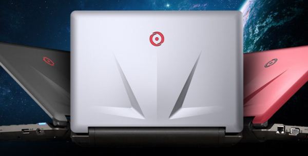
OriginPC offers a custom lid design with their W110ER (called the EON11-S), a sleek looking part that’s actually very reminiscent of the M11x lid. They offer it in matte black, matte red, or glossy metallic silver, and based on the pictures, it seems like a nice improvement over the stock lid. However, it’s worth noting that the EON11-S is more expensive than Eurocom’s Monster and doesn’t offer the upgraded screen as an option either (at least not at the time of writing).
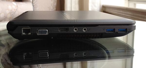
Looking around the Monster, we see a healthy allocation of ports—Gigabit LAN, VGA, HDMI, headphone/mic, and two USB 3.0 ports on the left side, along with a USB 2.0 and the AC port on the right. The left side also has a large vent, while the back is dominated by the removable 62Wh battery. The front has notification LEDs for power, battery, and disk usage but is otherwise clean. The Synaptics touchpad works as expected and features multitouch gestures and scrolling—two finger scroll works well, and the presence of physical mouse buttons is a relief.
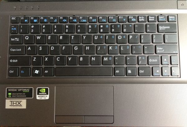
The most offensive part of the design is actually the keyboard, which has slightly shrunken keys and a layout designed to confuse and frustrate. The entire right-hand side feels truncated, with the forward slash and right shift keys narrower than normal and the arrow keys also narrow (but still full height). For reasons I cannot fathom, there is a second Fn key on the right hand side, located just above the right arrow key. Page up/down and home/end both exist only in the land of Fn keys, and the Esc key is also oddly small. Safe to say, I’m not a fan. The downsized keys don’t bother me much at all, though I suspect that a larger guy like Jarred would probably curse the keyboard anytime he had to use it. On the bright side, the keypresses are positive, with a decent amount of travel in the z-direction, and there's a pleasing lack of flex in the keyboard overall. Once you get used to the layout of the secondary keys, it's a decent keyboard.






47 Comments
View All Comments
ijozic - Friday, May 18, 2012 - link
Thanks for a review of this little thing; was waiting for something like this to replace my portable Acer 1810TZ, although I'd need a better matte display and a backlighted keyboard.But, just had to note that I don't really see why all the cries after the M11x. Personally, it looked like a very thick laptop designed around a 14" 4:3 screen with a 11,6" screen fitted instead. While I like the Clevo's effort, I wish it was made with a nicer design, better materials and a higher quality screen (though admittedly, there aren't seem to be any available in this size apart from the matte option used on some variants).
ImSpartacus - Friday, May 18, 2012 - link
Don't get rid of that 1810TZ. It's a goddamn gem.Darkstone - Friday, May 18, 2012 - link
I digged up the specification sheet of the M11x R3 display you tested: it features an advertised contrast ratio of 500:1. In fact, i have never seen a datasheet with an contrast ratio below that.Saying that the matte display is better than the standard glossy display based on a number in a datasheet, is just not right. Those numbers are never accurate for budget LCD's anyway.
Menty - Friday, May 18, 2012 - link
True, but saying the matt screen will be better than the glossy one is basically 99.99% true. Glossy screens are almost entirely terrible if you don't live in a dark cave, regardless of the numbers on the spec sheets.plewis00 - Friday, May 18, 2012 - link
This isn't necessarily true. Glossy screens are not terrible depending on the other specifications, I'd go as far to say contrast ratio and colour gamut are more important factors - the Dell XPS 15 1080p B+RGLED is a stunner however you look at it and I can compare that to my work Dell Latitude E6400 with a matte screen and I can't stand it, it looks dull and washed out.That said the Alienware M11x R3 was everything I wanted and expected from a computer like that with the exception of the screen - I loved the low idle power consumption meaning you could watch videos and browse the web in bed or on the sofa without heat being an issue.
JarredWalton - Friday, May 18, 2012 - link
We're trying to get a version of the laptop with a matte LCD in for testing. It almost certainly can't be worse than the glossy display, but is it better? As you point out, datasheets often "lie".I've seen LCDs advertised as 500:1, and what I found in testing is that if I measured white at max brightness and black at min brightness, I would get around 550:1. The problem is that the LCD didn't even support dynamic contrast, which would at least make such a claim partially true. So the LCD in question was something like 250 nits white/1.25 nits black at 100%, and 80 nits white/0.47 nits black at 0%.
I've got another laptop actually in house where the max brightness is 430 nits, but black levels at 100% are 1.66 nits. Drop to 25% brightness and you get 108 nits/.42 nits. Using the same "dynamic" range, the manufacturer might claim 1000:1 contrast, when the real contrast is closer to 250:1.
prdola0 - Friday, May 18, 2012 - link
I wonder if Asus comes with something similar/better. I would give my fist-born for a 11" 2core Ivy Bridge/GT640M Zenbook-style machine with Optimus, an Intel SSD 120GB inside and a matte screen with something like 1280x720 or so. Thunderbolt would be a great addition as well.Since this 11" Clevo is possible (although at the limit of thermals), my setup with smaller/slower CPU & GPU should certainly be possible too. Drop the D-Sub and Ethernet ports, leave just mini HDMI and Thunderbold and some USB 3.0, add backlit keyboard, and it is a bestseller.
htwingnut - Friday, May 18, 2012 - link
I own the Sager brand of this and have to say it is one sexy mini beast. A couple things to note is that if you just prop this laptop up at the back, temps can drop as much as 10C at load. The screen is a bit miserable, and should have been matte by default. It's impossible to use outside or with any kind of lights on in the background.Otherwise it runs like a charm. 60-80FPS in BF3 on high. Can even crank out games at 1080p without much issue.
bennyg - Friday, May 18, 2012 - link
I had a G51J that spent a LOT of its life with its GPU nearly boiling water. Sure it's not great, but the fact it survived 22 months without skipping a beat means high temps are somewhat tolerable. I made damn sure it sat on a cooler and the fan grilles and vents were cleaned every few months though. Ironically, it died when I ran over it... the base was resurrected minus a couple of ports and lives on as a ~50W HTPC now :)Every laptop with intake vents on the bottom benefit from being propped up or a cooler.
Meaker10 - Friday, May 18, 2012 - link
I think they could have taken the current M14X and slimmed it down into an edge 14" machine (tiny bezel).The 650M (which had GDDR5 btw instead of DDR3) at a native 1600x900 would be awesome.