Amazon Kindle Fire Review
by Anand Lal Shimpi & Vivek Gowri on November 29, 2011 3:31 AM EST- Posted in
- Tablets
- Mobile
- Amazon
- Kindle Fire
- Kindle
Books
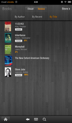
This being the Kindle Fire, the Kindle experience is the central focus here (other than making boatloads of money for Amazon). Hit the Books library, and you see an option at the top for Cloud and Device. All of your purchased books are located on the cloud, and you can download them to your Kindle Fire's local storage as necessary. The Fire has roughly 5.5GB of free space to use for content, so some content management will be required over time, particularly if you download a lot of videos to local storage. The books you own are displayed in list form, on a dark gray wood background. You can choose how you want your books organized, whether by title, author, or recently viewed.
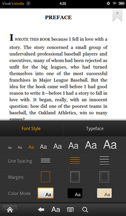
The reader itself is pretty standard, very clean. You can tap on the left and right of the screen to move back/forward through pages, just like you can on a regular Kindle. As soon as you get into the book, the notification and navigation bars hide themselves, allowing you to view the pages alone with no UI elements to distract from the content. Tap once to bring up the nav bar, and you see five options: the standard home, back, menu and search, this time joined by an "Aa" button to configure font and text display settings. There are three different options for margins and line spacing, eight different text sizes, and a choice of background colour (white, black, and a poor approximation of parchment that comes out about three shades too dark). The default typeface is Georgia, other options include Caecilia, Trebuchet, Verdana, Arial, TNR, Courier, and Lucida. I found the default settings very comfortable for reading, only changing to a black background and white text when reading in the dark but otherwise leaving the options untouched.
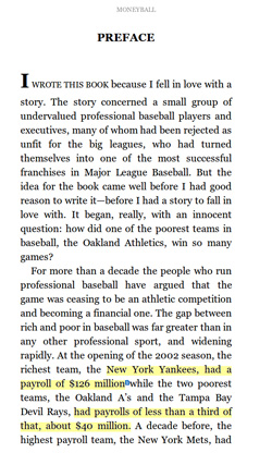
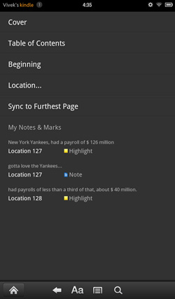
Search works well, showing all the instances of the word you searched for with a two-line snippet of text, along with the chapter and location number. Beyond that, you can select text, highlight, and add notes. If a single word is selected, the dictionary definition is provided in the option box. The text selection works exactly as it does in standard Gingerbread, so you can pick out groups of text for highlighting. In addition, you can choose to search the selected text in Google, Wikipedia, or other parts of the book. It's actually pretty fantastic for studying and textbooks.
The lone disappointment here is that the framerate of the page turning animation isn't really where you'd expect it to be given the quality of hardware on board here. It's not exactly choppy, but it's noticeably not as smooth as the experience on an iPad or other Android tablets.
Newsstand
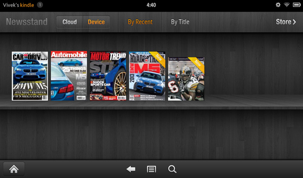
The Newsstand library works similarly to the Books library. You have every magazine issue arranged on a bookshelf similar to the one on the homescreen, again with options to view from the cloud or from local device storage and the choice to organize purchased magazines by title or recent viewing.
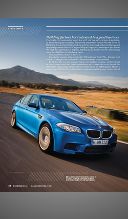
Once you pick a magazine, you're treated to a beautiful visual experience, with images rendering pretty crisply on the display. However, with the aspect ratio of magazines being different than the Kindle's screen, you end up with gray bars on the top and bottom. Also, the text tends to be impossibly small in page view. Zooming and panning a pain, and because the page is basically just an image object, the zoomed text isn't as crisp as one would like for comfortable reading.
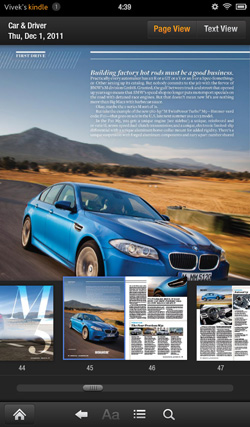
Thankfully, Amazon has tossed in a "Text View" option that functions similarly to the "Reader" function in the iOS 5 iteration of Safari, basically taking the text from the page and putting it in an environment nearly identical to the eBook reader environment. You can easily move between articles in the magazine with the menu button, so you don't need to leave text view to read the entire magazine. Tablets are supposed to give you the full magazine experience without limits. On the Kindle Fire, I found myself preferring to read magazine content in text view instead.
We see the same mild framerate slowdown from Books in the Text View mode, but it's in the actual magazine page view that you run into major issues (Get it, get it? No one? Sorry, bad joke.) It's way, way choppy - it's not even a lack of smoothness here, it's that page turns happen at something approaching 5 frames per second. Granted, given the image-rich nature of magazines, it makes sense, but that doesn't make it acceptable.





70 Comments
View All Comments
StormyParis - Tuesday, November 29, 2011 - link
The original Nook Color, at $200, was an heck of a deal. The current proprietary tablets (Nook Color 2 and Kindle Fire) are a lot less compelling due to the arrival of non-proprietary tablets at the same price point. Those are.. non-proprietary, and offer arguably better features.I'm still happy ith my original Nook Color. WHen it gets replaced, if it does, it probably will be by a true, un-walled-gardened, tablet.
Wierdo - Tuesday, November 29, 2011 - link
Ars had a good review of the Nook tablet here:http://arstechnica.com/gadgets/reviews/2011/11/lea...
"I have less doubt about the Nook Tablet as a capable product than I did about the Kindle Fire. The experience is not frustrating or jagged and doesn't feel as unfinished... However, I do have some doubts about the value of the Nook ecosystem. Amazon's selection in all categories seems a bit more diverse..."
rruscio - Tuesday, November 29, 2011 - link
I wanted an entry level tablet that was an eReader. Check. But ...1) I really miss having Skype on here. Really.
2) The lack of Google native apps results in my using the browser for gmail, Reader, et al. And then Google gives me links to all the other apps. Not the most comprehensible experience.
3) The single/double/drag tap issues are more annoying than they need to be.
4) wiFi isn't immediately available when the device wakes up. It takes some number of seconds to make the connection. The "wiFi not available" error is easily resolved by me tapping again. Why isn't is resolved by the app / OS waiting instead?
5) The entire software experience seems less than fully baked. Yeah, I get the Christmas rush thing, but I don't have experience with Amazon updating software. Hope isn't change.
6) The device feels familiar because I'm used to my Droid Inc. The speed is better, and the screen size is acreage versus postage stamp.
If there's ever a phone that just 1) phone calls 2) text messaging 3) wiFi hot spot 4) non-larcenous plan, I'd predict that, and a tablet in this form factor, will kill the smart phone business.
Great review.
genomecop - Thursday, December 1, 2011 - link
1. I dont miss it at all.2. Not true. It comes preloaded with an email app that has gmail setup.
3. Dont know what your talking about never have this issue
4. Dont have this issue and I use mine all day long.
5. Have no problem with the software at all. Everything works very smoothly.
Just want to add...I've had an Ipad since launch and I have since stopped carrying it around. This fits in my coat pocket for use at the gym while doing cardio. At work, on my desk for quick web browsing. RSS feed for all Tech related news. Gmail. Reading on the subway. Uses my phones hotspot in the cab for use. Quick download of movies. I think its a great device.
mcturkey - Tuesday, November 29, 2011 - link
In your conclusion, you state that $199 should be the entry level price point now. I'm anxiously awaiting your review of the Nook Tablet to see if that extra $50 is worth it (excluding my personal bias towards B&N for their willingness to fight back against Microsoft's ridiculous patent war against Android).tipoo - Tuesday, November 29, 2011 - link
Agreed, the new Nook looks interesting. I remember reading it has a larger battery than the Fire. Locking all but 1GB of its memory to B&N content sucks, but I'm sure someone will take that limitation off.Lucian Armasu - Tuesday, November 29, 2011 - link
Hardware wise, the extra 8GB of internal storage, extra 512 MB of RAM, and microSD slot, I think it;s worth it. Still I think the extra $50 would be worth it a lot more with the full Android experience. If the other Android manufacturers could put android 4.0 on an equivalent tablet to Kindle Fire, and price it at $250, I'd pick that one any day. You can still get all Amazon's services on the full Android, too, so no point limiting yourself for $50.nace186 - Tuesday, November 29, 2011 - link
I don't understand why you are comparing the Fire with all the tablet out there that's in a different class. What it should really be compare to is the Nook Color, and the Nook Tablet. Which either of them were included.Wierdo - Tuesday, November 29, 2011 - link
Yeah I read a review on Ars about it and they think the Nook tablet is a more capable product but Amazon has the edge in the ecosystem department, link posted on this thread somewhere if interested.VivekGowri - Tuesday, November 29, 2011 - link
We'll have a Nook Tablet review that touches on the comparisons to the Kindle Fire relatively soon :)