Apple iOS 5 Review
by Vivek Gowri, Andrew Cunningham, Saumitra Bhagwat & Brian Klug on October 18, 2011 3:05 AM ESTMost of the applications near the heart of iOS core competency have also gotten a refresh here. We’re talking stuff like Safari, Mail, Messaging, Photos, Music, Calendar, heck, even the Camera application gets a redesign here.
Music
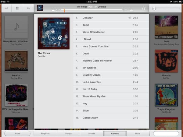
I’d like to start by lighting a candle for the iPod application on the iPhone and iPad. It has joined the ranks of the dearly departed, having now been split into “Music” and “Video”, as on the iPod touch. Other than the branding, the major overall changes are being able to play music while syncing your device and a couple of interaction changes. You can swipe sideways on a song to bring up the option to delete it from the device, and a long press on a song title will bring up the extended song information. But for the most part, on the iPhone/iPod touch side of things, the Music app stays basically untouched. It’s on the iPad side where things have really changed.
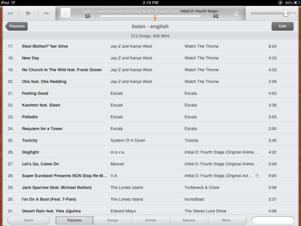
For starters, the iPad 2 now gets the ability to play 1080p video, but the real differences are in Music. The iPad gets a completely redesigned music player. While the previous iPod app looked like a lite-version of the desktop iTunes client, the new one looks nothing like it. You get a very low profile control/information bar at the top with playback controls and details on the song playing, plus a bottom bar to chose between playlist, song, artist, album, etc, along with a search field. The entire rest of the screen is dedicated to listing as many songs as possible. A few pixels on the right and left side have been devoted to thin, wood coloured borders. I legitimately have no idea why, since the colour they picked has nothing to do with the rest of the accent colours used in the OS (or any other version of iOS). It’s not a bad look, and it’s actually nice to have such a minimal interface for music.


86 Comments
View All Comments
simi13 - Tuesday, October 18, 2011 - link
I could swear I am on 9to5mac.com (I read anand and that daily), hahaha. A very nice review, though.MobiusStrip - Tuesday, October 18, 2011 - link
It does fail to mention a glaring omission in the OS, though: repeating, AUDIBLE notifications of MISSED CALLS.This was inexcusable in version 1, but after five or six years, Apple's phone still lacks an important, common-sense feature that was found on cell phones in the '90s. Aren't people sick of missing time with their friends and families because they didn't find out they called until the next day?
Your phone is on its charger on your dresser, and you're taking a shower when someone calls; the phone gives one little chirp immediately after the call and never again. WTF? If you missed the call, it stands to reason that you're going to miss a single noise right after it. The thing should (OPTIONALLY) notify you periodically that someone called, until you cancel the notification.
Even more bafflingly, Apple added repeat-notification controls for TEXTS. So if there's an emergency in my family and my parents want to get in touch with me, we're assuming they'll TEXT me? Brilliant, Apple. You have to wonder what kind of retards make these decisions over there.
eallan - Tuesday, October 18, 2011 - link
I hope Apple adds the option for people that want it, but man, that is one specific complaint.I don't think I've ever wanted the feature. Just wake your phone up after a shower? Whats the big deal?
I think that may be the most rare complaint about iOS. Hardly makes them "retards" for not adding a specific niche feature. Relax
Booster - Tuesday, October 18, 2011 - link
"I don't think I've ever wanted the feature. Just wake your phone up after a shower? Whats the big deal?I think that may be the most rare complaint about iOS. Hardly makes them "retards" for not adding a specific niche feature. Relax"
Sorry man, but it IS a big deal. Who in the hell would want to wake his phone periodically? Don't you realize how stressful this is? You'll never get to 'relax' knowing someone might have called or texted you etc. You'll be constantly checking out your iPhone and over time this will drive you crazy. Not a small matter by any means and surely not 'niche', since every freaking user suffers from this.
If iPhones were really that good, they'd have a dedicated LED indicator for missed events and sufficient options to customize alerts, but they would be off by default so idiots wouldn't complain that their iPhone is bugging them. Leave it disabled by default, that's fine, might even add a warning before activating alerts, but this feature just needs to be there, man.
Bob-o - Tuesday, October 18, 2011 - link
> If iPhones were really that good, they'd have a dedicated LED indicatorAgreed. It was only last weekend, when my neighbor was showing off her new 4S, that I realized you couldn't just look over at the phone to see if you have a txt/email/voicemail waiting for you. Something my Treo 650 used to do just fine.
As great as new phones are, it is amazing how some of them have taken steps backwards in many little ways.
robco - Tuesday, October 18, 2011 - link
That's all well and good if you're home alone, your phone rings, you aren't available, you find out when you return. However, I do recall back in the day, being in a public place, someone's phone rings in their purse or jacket, they're off in the bathroom or in a meeting or something. Not only do you have to listen to their phone ringing, but then you have to listen to the audible beep every so often and that can get quite annoying. Convenient for you, not always convenient for those around you.Honestly, get into the habit of checking the phone when you've been away and out of earshot. One quick tap on the sleep/wake button will let you know if you've missed something. Otherwise yours is the phone people are going to want to smash with a sledgehammer because it's beeping every few seconds.
Booster - Tuesday, October 18, 2011 - link
"Honestly, get into the habit of checking the phone when you've been away and out of earshot. One quick tap on the sleep/wake button will let you know if you've missed something. Otherwise yours is the phone people are going to want to smash with a sledgehammer because it's beeping every few seconds."I'm more concerned with my personal psychologic wellness rather than with what irritates the others. Then again, why not include the feature but disable it by default? Morons won't even care to enable the cornerstone feature of any mobile device, but those who care - they will.
You probably don't realize how retarded the 'quick tap' concept is, how extremely inconvinient for the user. Why should he or she pimp the damn square button every now and then? There is just no excuse for not really caring about end users.
snuuggles - Wednesday, October 19, 2011 - link
Hmmm, I think you are too-quickly dismissing a valid point. I mean, there are actual laws about car alarms that go off repeatedly because they are so amazingly annoying. I think your repeated noise idea is along the same line. A dedicated light might be a better compramise.Honestly, you seem a little unhinged, I somehow doubt that adding this single notification feature will allow you to have better "personal psychological wellness."
Maybe you should get rid of the phone if it's that important. Unless you are a doctor or the president, being reachable isn't *that* important.
kezeka - Thursday, October 20, 2011 - link
I am in medical school and I can personally vouch against doctors wanting to be within earshot. If we aren't on call (you would have a pager for this) then there is no reason to constantly check the phone. There are instances where I can see it being necessary.That said, I leave my phone completely silenced all day, every day and just check it periodically to see if anyone has tried to contact me. If they have, I call them back. It isn't worth breaking your concentration to be completely on top of things (insert link to any number of articles suggesting the human brain is horrible at multitasking here).
name99 - Thursday, October 20, 2011 - link
I actually am with MobiusStrip here. Different people use their phones in different ways, and I'd appreciate a more aggressive reminding of missed calls.A similar problem (which I reported as a bug a year ago, but which is still not fixed) is audible notification of text messages. Suppose you have your phone connected to a BT headset or headphones, and a call comes through. The phone is smart enough to realize that it should still ring the phone speaker because you may not actually have the headset or headphones plugged in. But it does not extend that same level of intelligence to other notifications, most obviously text messages --- but I think also Skype or Viber calls.