CyberpowerPC's Compal NBLB2: Affordable Gaming
by Dustin Sklavos on December 21, 2010 5:50 PM EST- Posted in
- Laptops
- AMD
- Intel
- CyberPowerPC
- Compal
Another Good 15.6" 1080p Screen
The other big reason we wanted to get our hands on the Compal NBLB2 was the screen: the notebook comes with a 1080p, LED-backlit screen standard: none of that weak 1366x768 stuff here. This is the third one of these we've seen recently and at this point it's fairly clear to us that if you want a halfway decent picture from your notebook, 1080p is just the way to go.
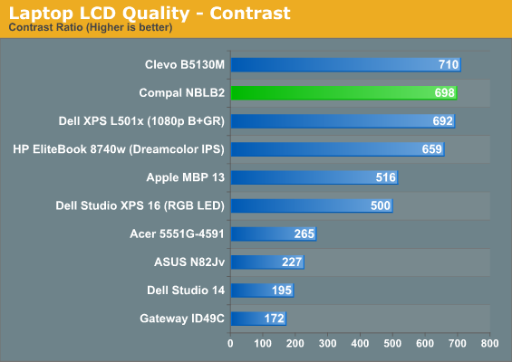
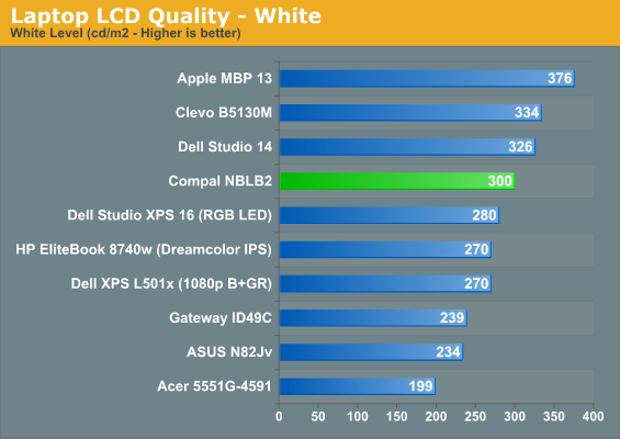
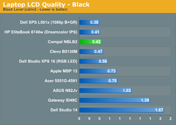
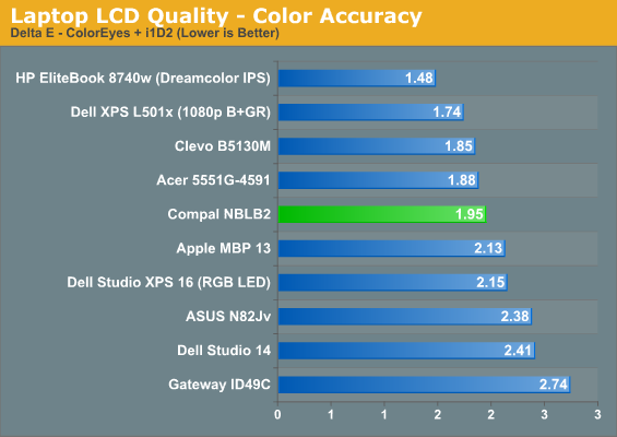
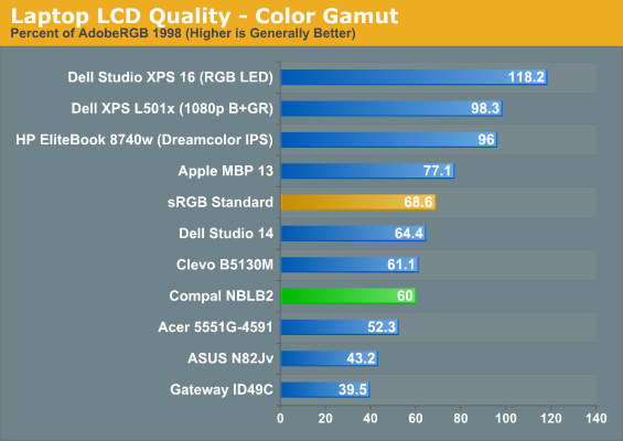
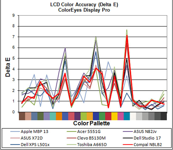
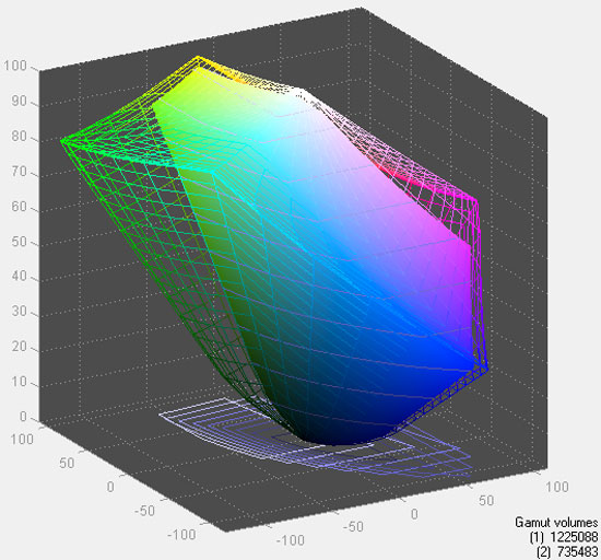
Once again, the 1080p screen ranks near the top of our list. While the color gamut and accuracy aren't among the best, they're not terrible either. Contrast is pretty stellar, though, and again the overall image quality is subjectively attractive. It seems like there's also much less fussing over finding the "sweet spot" with these 1080p panels.


36 Comments
View All Comments
rangerdavid - Tuesday, December 21, 2010 - link
Love your articles and site in general, but please: When using your DSLR to take a gallery of photos, tighten that aperture down four or five stops from wide-open, as you currently take your photos (probably necessitating a slow shutter speed and a tripod). Yes, some shots lend themselves to nice blurry depth-of-field effect, but not everything.Keep up the great work and Happy Holidays to you all.
JarredWalton - Tuesday, December 21, 2010 - link
I think you've got it backwards... I prefer to shoot at a 14 f-stop and ISO 400, since the low f-stops give you the depth-of-field effect. They let in a lot more light, but I prefer a good flash over the blur. But otherwise I agree; Dustin needs to figure out the pictures better. (Sorry, Dustin, but it's true! At least he's no longer using a point and shoot.)Dustin Sklavos - Tuesday, December 21, 2010 - link
Oh believe me, I know. I'm getting there. Give me a video camera and I'll make it sing, but still photography utterly escapes me for some odd reason.rangerdavid - Tuesday, December 21, 2010 - link
Note: NOT Trying to start a flame war....but I believe I had it right - yet it's confusing and I may not have been clear. A "wide" or "open" aperture is definitely a SMALLER number. This is a bit counter-intuitive. I should have said "tighten that aperture UP a few stops," even though I usually uses the phrase "tighten down" in common speech. I suppose both are common. The point:
Higher f-stop = narrower aperture opening = greater depth-of-field = more of the laptop in focus.
So I agree: Shooting at f/14 is a better choice than the wide-open f/3.5 or whatever he's using now. For more info:
http://www.dpreview.com/learn/?/key=depth_of_field
Deinonych67 - Tuesday, December 21, 2010 - link
You were correct using the term "stopping down" in reference to reducing the aperture size.http://en.wikipedia.org/wiki/Stopping_down
Stuka87 - Tuesday, December 21, 2010 - link
I actually got a kick out of the isometric shot that is on the main page. It basically has a tilt shift effect on it, making it look like something you would buy for your daughters barbie dolls.DanNeely - Tuesday, December 21, 2010 - link
Since it appears that high quality screens are available almost exclusively in glare finishes these days, could you do a review comparing the out of the box quality of the screen with the results after applying a filter to it? Mwave.com and Viewguard.com both sell filters in many sizes, so finding on to fit shouldn't be that difficult.hybrid2d4x4 - Wednesday, December 22, 2010 - link
I second this request. I don't like the dull low-contrast screens any more than any of the others who regularly complain about these things, but I hate glossy screens even more. When I saw the picture of this laptop on the AT front page and saw the reflection of the keyboard, and that glossy plastic on the bezel, my gut reaction was: "Aw, FFS...".Meaker10 - Tuesday, December 21, 2010 - link
Notebook manufacturers typically use different internal coolers for the quad core models, thicker heatpipes and better fans are usually used.Dont assume just because your dual core version was comfortable that it impacts how the quad core model may fare.
CreateAccount - Tuesday, December 21, 2010 - link
looks like a samsung or toshiba.reflective surface, who started this trend? It's never been cool.
what happen to the brushed metal or the touchy plastic surface like the bottom case of the notebook? Bring those things back. That will cut the cost of the notebook. We don't need a notebook to looks pretty, we buy it to WORK! "WORK" that's the main purpose of it. Let those pretty stuff for A*ple, we don't need it.