The Sony Xperia 1 Review: A 21:9 Take of the World
by Andrei Frumusanu on July 26, 2019 8:00 AM EST- Posted in
- Mobile
- Sony
- Smartphones
- Xperia 1
Display Measurement - Professional 4K Screen?
The centre-piece of the Xperia 1 is the new 4K OLED screen. This is the first of its kind in smartphones, and Sony’s marketing focuses very strongly around it.
The display panel is supplied by Samsung and uses a newer DDIC generation. I’ve been trying to investigate as to how Sony implemented the 4K resolution in terms of the connectivity between the SoC and the DDIC. Whilst I haven’t been able to find explicit mention of it, I do think that the phone uses two MIPI interfaces as I’ve seen software evidence of the display rendering in two halves. The reason for going with two interfaces is that a single MIPI-DSI with D-PHY 1.1 or earlier is that the interface doesn’t have sufficient bandwidth to transport resolutions higher than 1440p at 60Hz, even with DSC (Display Stream Compression).
OnePlus surprised me earlier this summer with the OnePlus 7 Pro which was seemingly bypassing this limit and employs a 1440p 90Hz screen with a single interface, resulting in lower power draw than expected.
My assumption on Sony using dual interfaces is also strengthened by the base power draw of the phone: At 538mW all black screen it’s noticeably higher than the competition, which again likely is due to the higher resolution and the DDIC having to work more pixels.
As for the 4K resolution itself: It’s immensely sharp, however I have to remind users that everyday applications are not actually rendered at the native 4K, but rather at a reduced resolution of 1440p. The full resolution is only available when viewing pictures in the native photo app, or when viewing videos on YouTube or applications such as NetFlix. I do find this somewhat of a pity as text rendering would be very much the use-case that would most benefit from the higher resolution.
However, even though the software only renders 1440p in applications, it’s still a much better experience and it’s still a lot sharper than a regular 1440p screen. The OLED’s pentile display matrix is still a ton finer and the scaling and interpolation still greatly benefits the sharpness of the content, even at 1440p rendering. In fact, even though I’m near-sighted, I’m not able to make out the pixel matrix of the display even at the closest possible distance my eyes can focus at, whilst I do see it on 1440p panels such as on the S10+’s.
In general, one can argue that the 4K display is pretty much overkill for everyday scenarios, and I would actually agree with that notion. The times where I would actually have close enough and bright enough for the resolution to make a notable difference in experience is very rare.
We move on to the display calibration and fundamental display measurements of the Xperia 1 screen. As always, we thank X-Rite and SpecraCal, as our measurements are performed with an X-Rite i1Pro 2 spectrophotometer, with the exception of black levels which are measured with an i1Display Pro colorimeter. Data is collected and examined using SpectraCal's CalMAN software.
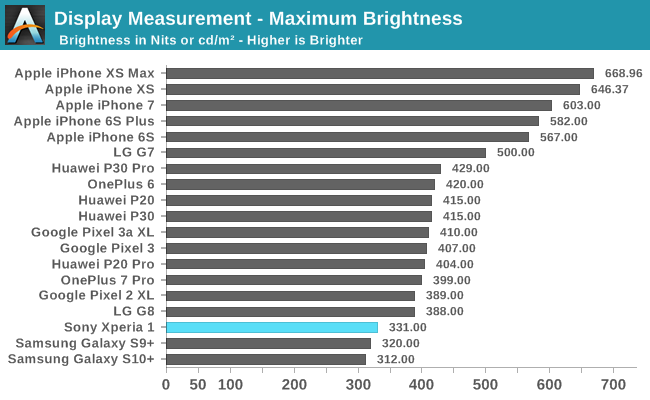
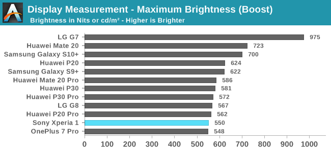
In terms of the brightness characteristics of the display, the phone goes up to around 331 nits at maximum manual brightness, and will go to up to 550 nits in adaptive brightness mode when under bright conditions (APL100). The screen has adaptive brightness scaling with APL so it will go brighter in peak brightness for lower APL content, and in general I found zero issues with the display’s performance even under direct sunlight, as it still managed excellent contrast levels.
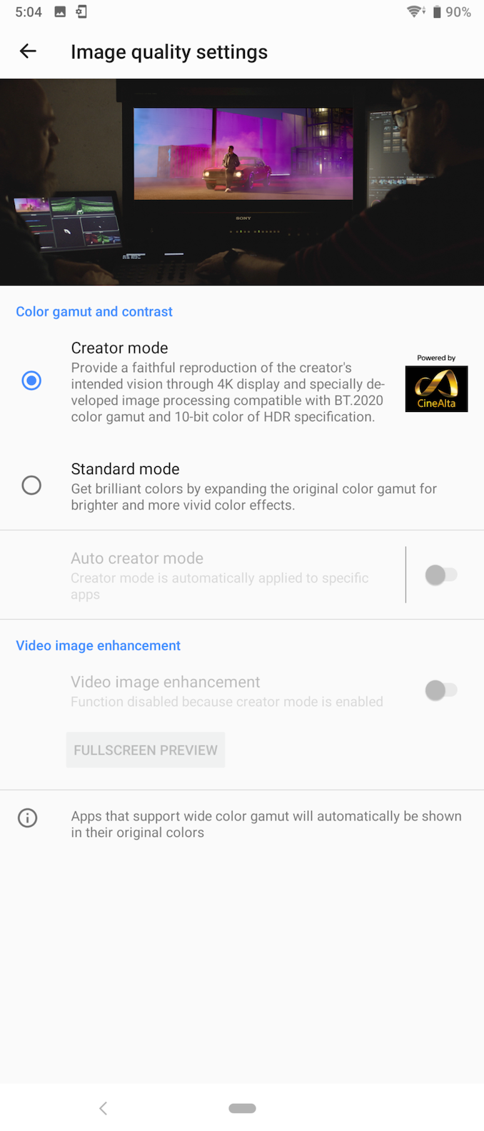
Yes, unlike what the configuration settings menu says and what Sony keeps annoying reminding you of via notification when in the mode, the Creator mode isn’t actually a BT.2020 colour gamut. Frankly I have no idea where this BT.2020 gamut is supposed to appear as I haven’t been able to find any content or mode that triggers it. There’s no evidence of it in the phone’s drivers, and even any HDR video content will specifically have the panel switch to a P3 gamut. I’ve reached out to Sony for clarification, but at time of writing haven’t heard anything back yet.
Furthermore, the “10-bit colour” part also is seemingly misleading. The display panel is only 8-bit and it relies on tone-mapping to display 10-bit HDR content, which is essentially standard for how any other phone does it.
In fact, when reading the Xperia 1’s specification sheet, we find a few footnotes in regards to the gamut and the bit depth, as if Sony’s legal department realised their marketing department was a bit too eager in terms of making claims.
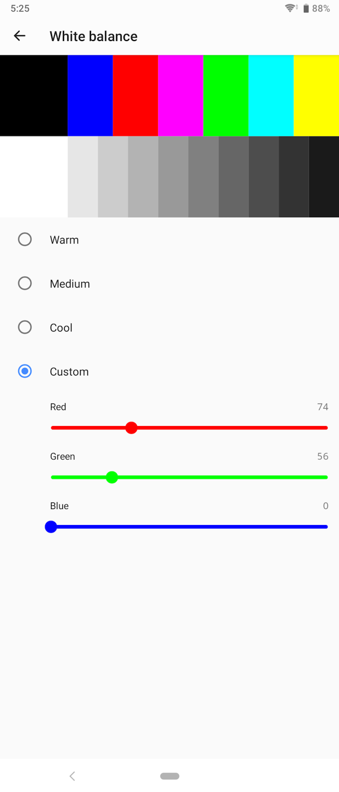
The colour temperature controls however are quite welcome: here Sony allows pre-sets as well as manual controls for both display modes, which is better than what a lot of other vendors offer. Unfortunately I found that none of the pre-sets actually target a 6500K temperature, but since this can be customised and the UI has discrete values, I’m able to share my settings like how I calibrated it on my review unit.
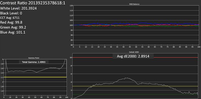
The phone comes in the standard mode with a much too inaccurate and cold colour temperature, which is a bit disappointing given how Sony markets this as a great content creator screen. Setting the Creator mode we also see that even on the “Warm” setting things are still far too blue with an average CCT of 7071K. I set up a custom setting getting accurate 100% white at near 6500K, however we still see the temperature still varies quite a bit at the lower levels and is sometimes too blue, resulting in the average of 6700K.
What is really out of the norm here is that Sony is targeting a gamma of 2.5 for the Creator mode. I’m not sure if this is deliberate or not, but it’s not exactly in line with DCI-P3 which targets a gamma of 2.6, nor is it in line with Display P3 which targets 2.2. In fact, because this is a sRGB gamut for most content I’d argue it’s completely off the mark with any standard.
Oddly enough again, the “Standard” mode doesn’t have nearly as a high gamma, whilst still not accurate to a target of 2.2, it ends up still a bit off at 2.31. It’s to be noted that these measurements were done at APL50 and windows size of 50%, which due to the display’s adaptive brightness can impact the accuracy of the numbers.

Creator Warm against Gamma 2.2
Looking at the patterns, we again see that the default Warm mode is too blue, and we also see the tones are too dark.

Creator Custom against Gamma 2.2
Correcting the colour temperature resolves one issue, but the gamma problem is still present and we’re not able to fix this.

Creator Custom against Gamma 2.5
Comparing the result again against a gamma target of 2.5, we see nearly perfect patterns, pointing towards that this was indeed a deliberate calibration for the 2.5 target.

Standard Custom against Gamma 2.2
Finally, the standard mode with corrected temperature is near accurate with just a slight offset in the gamma.
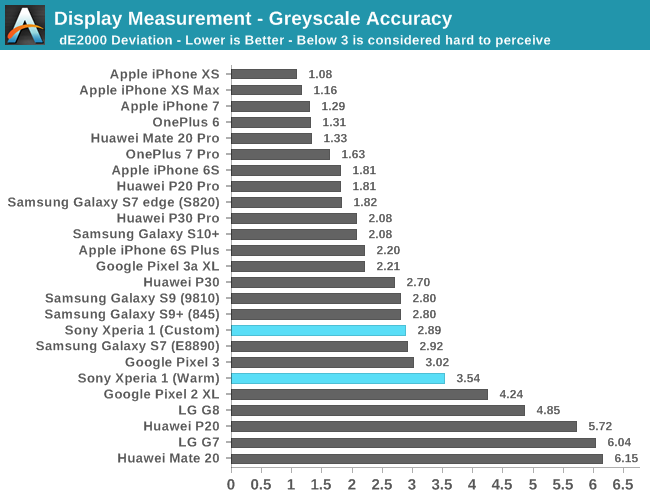
In the end, the greyscale accuracy of the phone isn’t very good with a dE2000 of 3.54. The colour temperature can be improved with the aforementioned custom settings and this does improve the score a bit, however the gamma issue isn’t something that’s solvable for the Creator mode and the phone is far off the mark for the standard consumer content target of 2.2.

SpectraCal CalMAN
Creator (sRGB) against Gamma 2.2 and Gamma 2.5
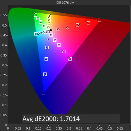
Moving onto the saturation accuracy measurements, we’re seeing some interesting but troubling behaviour. When measuring against a target gamma of 2.2, the saturations look seemingly correct with an overall dE2000 of 1.7. However, we did discover that the greyscale levels aren’t targeting a gamma of 2.2 but rather 2.5. When comparing the saturations against such a target, we see that they’re far off and not quite reaching the levels they should be.
This is a bit of a contradiction and the only possible explanation is that the display is simply miscalibrated, with the luminosity values being off while the chromacity values aren’t quite as bad against a 2.2 gamma.
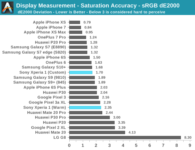
Overall, the saturation values with the corrected colour temperature target isn’t quite bad with a dE2000 of 1.7, while the warm preset comes at a worse off 2.35.
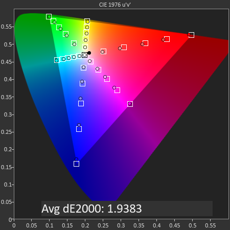
SpectraCal CalMAN
Standard (Display P3) versus Gamma 2.2
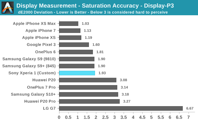
The “Standard” mode which targets the P3 space is adequate and ends up with a dE2000 of 1.93. It’s to be noted that a P3 target is also used for video content, however I don’t have a test methodology prepared for video and as such not able to measure it in the Creator mode.
SpectraCal CalMAN
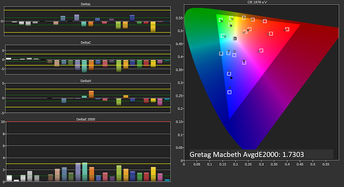
GMB Creator Custom against Gamma 2.2
SpectraCal CalMAN
GMB Creator Custom against Gamma 2.5
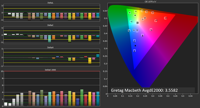
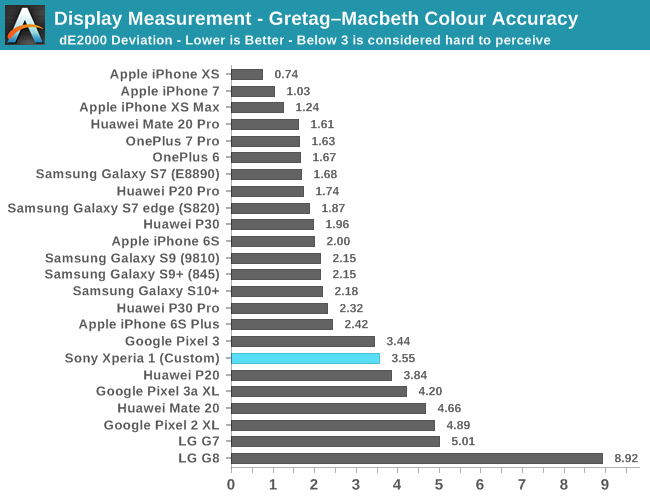
Finally, the Gretag MacBeth chart of common colour tones better represents the oveall accuracy of the display. I again present the chart both against a gamma target of 2.2 as well as 2.5, and we again see that in the latter target we see the luminosity error of the Xperia 1’s Creator mode disappear.
Unfortunately in both modes there’s still a large chromacity error due to undersaturation (and in general due to the not full coverage of sRGB), which does give the display a worse off result.
Display Conclusion
Overall the Xperia 1’s display is a double-edged sword. The panel itself is excellent with fantastic viewing angles and the 4K resolution gives for outstanding uniformity and sharpness that is above that of other displays. On the other hand, 4K is very much overkill and unless you’re used to holding phones right up to your face, you will not be able to tell the difference to a regular 1440p screen.
Colour calibration of the Xperia 1 is very odd and very much off the mark. The Creator Mode which is supposed to be an accurate display mode for professionals and content creators is very evidently the mode which has the worst problems, which is ironic. There’s a very stark contradiction between the gamma behaviour of the luminosity and the chromacity of colours, and it somehow feels like a repeat of what we saw on Google’s Pixel phones, only this time around it’s very embarrassing for Sony as they’re actively promoting the mode in the phone as well as the marketing materials.
In general the issue with the gamma is that things appear too dark, and in the very first few hours I had with the phone this had given me the false impression that the screen just doesn’t get as bright as it should.
The colour temperature settings are also disappointing as none of the presets actually target the more accurate 6500K white point, with all of them being far too cold. At least here Sony gives the option to fine-tune it and we’re able to share the discrete values for better white levels.
Overall, it’s still a good display, but given the Xperia 1’s price point and targeted audience, I expected a lot more on the software side of things as the calibration just seems amateurish.




75 Comments
View All Comments
yetanotherhuman - Friday, July 26, 2019 - link
I'd rather they'd bring back the Compact series, and don't compromise it this time with lacking headphone jack and so on. The last one they made was super thick and yet lacked a headphone jack or wireless charging. Ugh.yetanotherhuman - Friday, July 26, 2019 - link
Oh, and make it actually compact, like the older Compact ones. I use a Z3 Compact still as my work phone, and it's so goddamn nice in the hand compared to other phones I come in contact withExodite - Friday, July 26, 2019 - link
+1 for the Z3C! :)Still using my green one, though the front glass is starting to come off and I really should get that fixed. It's coming up on 5 years old soon and it's by far the best device I've owned.
It's unfortunate AT got to review Sony devices now that they're past their prime. Their current units drift ever more toward the generic curved-screen, camera-hump-endowed, subpar aspect-ratio blandness that most other vendors offer.
While the Z3C was, and is, great and unique there's nothing particularly compelling about The Xperia 1 over competition from, say, One+.
boredsysadmin - Friday, July 26, 2019 - link
No 3.5mm jack = no sale, at least not for me. The lag on BT phones is unacceptable for gaming and they can shove their 'orrible dongles or semi-proprietary usb-c phones up their collective asses.pmcorriveau - Friday, July 26, 2019 - link
I don't know why more companies don't at least include 2 USB-C ports. I have C headphones, but I'm still frustrated by not being able to charge and listen at the same time. Stopping a movie on a plane just to charge my device sucks.yankeeDDL - Friday, July 26, 2019 - link
I think a USB port takes up more real estate than a jack.I like bluetooth, but I constantly use plugged in headset while working: on huge phones there's no excuse.
s.yu - Sunday, July 28, 2019 - link
But it's thinner, the excuse was thickness, it was always an excuse but a second C port doesn't add to thickness. I can live with a C port substituting a 3.5mm, but not without a second port of any kind.Jay1984 - Sunday, July 28, 2019 - link
Why do that if there is wireless charging?eldakka - Sunday, July 28, 2019 - link
There are dongle's that allow charging and headphones simultaneously.Unfortunately, it does mean carrying around more stuff with your phone, which reduces the mobility aspect of mobile phones...
flyingpants265 - Monday, July 29, 2019 - link
Pretty soon, they'll start integrating those dongles INTO the phone itself. Futuristic technology...