The Nexus 6 Review
by Brandon Chester on November 12, 2014 1:00 PM EST
When consumers think of Google's Nexus devices, they think about the promise of receiving the latest updates for Android essentially as soon as they release. They also think about the value proposition that Nexus devices provide by giving good hardware at a price significantly lower than other smartphones. However, this was not always the case. The Nexus One, Nexus S, and Galaxy Nexus were all priced at the same level as other flagship smartphones. It was only with the launch of the Nexus 7 at $199 that we began to see a trend of inexpensive but still high quality devices coming from Google. That hasn't changed at all in the past few weeks. The Nexus 5 and Nexus 7 are both still available, and they still provide a very high quality experience, arguably better than some other smartphones that are both newer and more expensive. But Google's newest devices take aim directly at other flagship devices with both their specs and their prices. At $399 the Nexus 9 positions itself against Apple's iPad Mini 3, while the Nexus 6 at $649 goes up against essentially every other flagship smartphone.
On paper the Nexus 6 doesn't really bring much to the table that sets it high above the competition. This is a consequence of it launching so late into the year, with other companies having already released their new flagship devices. That being said, how a device looks on paper does not translate into how good it is in actual use. There are lots of cases of powerful phones that disappoint, and phones that are weak on paper that end up being surprisingly good. It's still helpful to know what hardware you're dealing with, so I've laid out the specifications of the Nexus 6 below, along with the Nexus 5 as a point of reference.
| Google Nexus 5 | Google Nexus 6 | |
| SoC | 2.26 GHz MSM8974 Snapdragon 800 | 2.7 GHz APQ8084 Snapdragon 805 |
| RAM/NAND | 2 GB LPDDR3, 16/32GB NAND | 3GB LPDDR3, 32/64GB |
| Display | 4.95” 1080p IPS LCD | 5.96” 1440p Super AMOLED |
| Network | 2G / 3G / 4G LTE (Qualcomm MDM9x25 UE Category 4 LTE) | 2G / 3G / 4G LTE (Qualcomm MDM9x25 UE Category 4 LTE) |
| Dimensions | 137.84 x 69.17 x 8.59mm, 130g | 159.26 x 82.98 x 10.06mm, 184g |
| Camera | 8MP Rear Facing, 1/3.2" CMOS size (Sony IMX179), F/2.4. 1.3MP FFC |
13MP Rear Facing, 1/3.06" CMOS size (Sony IMX214), F/2.0. 2.1MP FFC |
| Battery | 2300 mAh (8.74Whr) | 3220 mAh (12.236Whr) |
| OS | Android 5.0 Lollipop | Android 5.0 Lollipop |
| Connectivity | 802.11a/b/g/n/ac + BT 4.0, USB2.0, GPS/GNSS, NFC | 802.11a/b/g/n/ac + BT 4.1, USB2.0, GPS/GNSS, NFC |
| SIM Size | MicroSIM | NanoSIM |
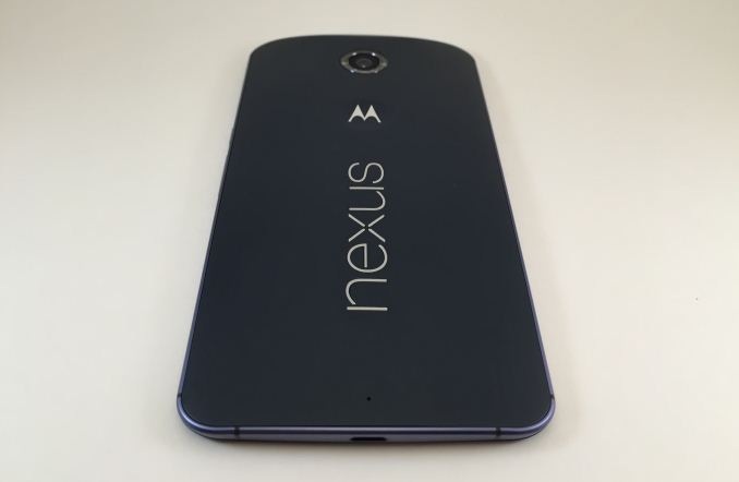
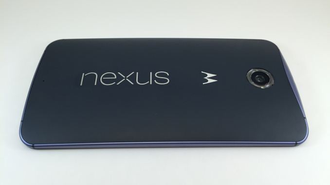
The design of the Nexus 6 is interesting in how it differs from all other Nexus devices, including the Nexus 9. Although the Nexus 9 launched alongside the 6 and is manufactured by HTC, it retains the slightly slanted flat sides and back cover design from the Nexus 5 which is made by LG. The Nexus 6 is made by Motorola, and it follows the style of design that we've seen on their other devices. The back of the device is heavily curved, with a plastic cover that meets a contoured aluminum frame which slopes downward at the top to accommodate the 3.5mm headphone jack and SIM card tray. Both the plastic back and the aluminum sides feel good in the hand, but due to the sheer size of the device your hand tends to rest more on the back cover instead of arching over it, so it doesn't quite have the premium feel of metal devices like the HTC One (M8) and the iPhone 6. Anyone looking to upgrade from the Nexus 5 should also know that the back cover does not have a soft touch finish like the black Nexus 5, and instead has the slightly rougher eggshell feel of the white Nexus 5.
Like always, the back of the device displays the word Nexus in all lowercase characters, and the manufacturing partner's logo which in this case is the slightly indented Motorola logo that appears on all of their other smartphones. Above that is the 13MP camera which is surrounded by a plastic ring that houses the two LED camera flashes. Unlike previous Nexus devices, the camera on the Nexus 6 is aligned in the center rather than being put in one of the upper corners.
The volume rocker and power button on the Nexus 6 are both on the right side of the device, and are placed close to the center of that side so they can be easily used even with the phone being so large. The power button is also textured with a series of small lines so that it can be easily distinguished from the volume rocker. While I had no issues finding the power button, I often found myself pressing the wrong half of the volume rocker which is very slippery and made of a single piece of ceramic. In general I've always preferred having separate volume buttons and the Nexus 6 is no exception.
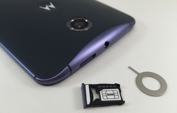
For some reason one of the parts I found myself really liking about the Nexus 6 is its nanoSIM tray and tray ejector tool. The tray has a much better design than other devices like the iPhone, HTC One, or Nexus 5 which are essentially just a metal frame that you place the SIM into with no mechanism to hold it in. The tray on the Nexus 6 has tiny notches that hold the SIM in place once it has been inserted, so that it doesn't shift or fall out. It's also fitted very well to the bezel of the device, with no misalignment or fitting issues which were both complaints about the SIM tray on early Nexus 5 units. The ejector is also small and fits well on a keychain which I appreciate, as I like to have one with me in case my primary phone's battery dies.
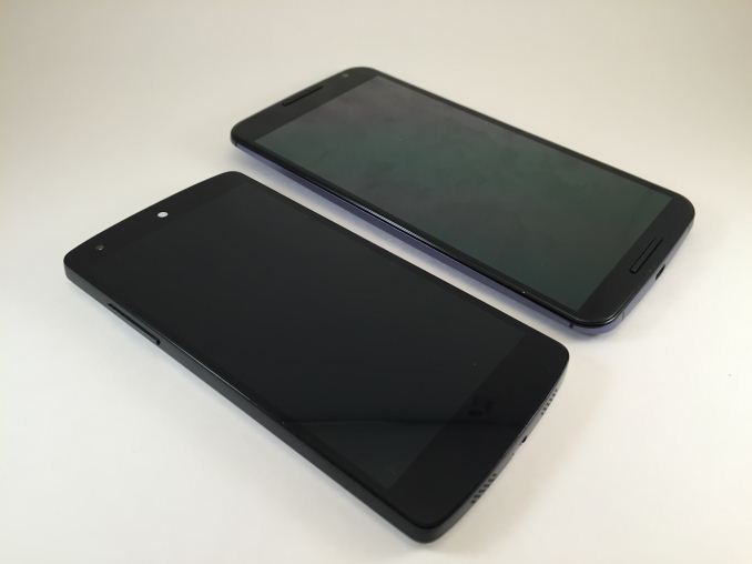
The front of the device is dominated by the large display, with minimal bezel on the top and bottom to include the stereo speakers and front facing camera. Compared to the Nexus 5, the Nexus 6 is thicker and taller, but the curved back and smaller top and bottom bezels help to alleviate that. The increase in width is the most noticeable change from the Nexus 5. The Nexus 6 is a massive smartphone, and its size makes it a firmly two handed device. Of course, that's the point of the device. Having a large display allows you to display more content on the screen and creates a more immersive experience when viewing videos and playing games. It's a larger device than the Nexus 5 because it's meant to offer a different experience. Compared to other phablets like the iPhone 6 Plus and Galaxy Note 4 the Nexus 6 is somewhat more difficult to hold, but not to the extent that I would say it poses an issue.
The comparison to the Nexus 5 is also interesting because Google is still selling the device, and so one could argue that the Nexus 6 is merely an addition to Google's lineup rather than a replacement. While this is a fair point to make, it doesn't address how users who prefer the smaller size of the Nexus 5 are also stuck with an ageing hardware platform. In the end there are always going to be tradeoffs to any device, and a buyer must consider how well a device fits the tasks they want to perform with it.


136 Comments
View All Comments
Spunjji - Friday, November 14, 2014 - link
A better battery and camera in this would persuade me to upgrade in a heartbeat. I only hope that if they eventually replace the 5 with an equivalently-sized phone (5 2015?) they keep the wonderful screen.niva - Friday, November 21, 2014 - link
Yes, I'm hoping for a Nexus 5 refresh with all the new fluff like the chip/ram/camera and battery. I think the Nexus 5 design and screen are perfect. My wife has a Nexus 5 and I'm still on my Gnex. Was hoping to get the 6 but with the size and price I'm going to wait some more. Roll on the Enyxos 810 phones and I might get whatever runs pure Android.PS. I cannot stand Touchwiz/Sense and whatever LG and Sony are doing on their "flagships." Thankfully Motorola has mostly stock interface.
techconc - Friday, November 14, 2014 - link
LOL! Good luck with that. The Nexus 5 is known to have weak radio signals and overall poor cell and WIFI reception. Not exactly the best choice and it's not really competitive with recent devices.owan - Wednesday, November 12, 2014 - link
Because Google isn't a charity?synaesthetic - Thursday, November 27, 2014 - link
Google would have been better off making another "almost-flagship" at the $350 price point. I've been using Nexus devices since the Nexus S, but now... no, it's just too damn big and too damn expensive.algarblandom - Wednesday, November 12, 2014 - link
Having a Nexus 5, I see very few reasons to upgrade to this, unless you stronly like phablets. But in almost every area (battery life, camera, cpu performance, software..) it is almost a draw.anactoraaron - Wednesday, November 12, 2014 - link
I'm curious, you've listed the nexus 5 as running lollipop in the first comparison chart... is it running the dev preview or the official release (that's MIA to the public)? Also, are the rest of the charts where the nexus 5 is listed results from the original kitkat release or from a lollipop build? I'm asking because the camera experience was greatly improved with the dev preview for the 5.Also I was worried about the display with moto making the 6... looks like that was justified. The 6 needs a price drop to sell IMO. As you state, the Note 4 is so much better on battery life and display and can be had for only $100 more (if you have T-Mobile anyway).
anactoraaron - Wednesday, November 12, 2014 - link
I'm just saying it's confusing to show the 5 as having Lollipop but show the original test results from 4.4.DILLIGAFF - Wednesday, November 12, 2014 - link
amenAT are comparing apples to oranges in charts and then writing words about pumpkins. i think the methodology error is that you (you as in AT staff) combined a performance review of a new os and a performance review of a new piece of hardware one too many times when it comes to phones. it worked for a while but this release its clear as mud... the outcome is that this review basically sitting in a vacuum- nothing to compare to objectively, so now your subjective comments are worth more than the benchmarks, which at this point are arbitrary. it's like benchmarking a new motherboard and using a just-released retail windows 8.1 on the tests of that new board, while the other motherboards in the benchmark charts are run on an windows 7 or windows 8. except there is no label in the charts to indicate which device is running what os. i bet if you did this with pc benchmarks people would flame you to death.
while i understand your position with a new device and os combination making things more difficult to test, you make things more confusing by labeling the spec table for nexus5 as having os lolipop...yet the bench charts you show are for nexus 5 running the original release of kitkat.
imho to address this issue in this specific review you should run additional benches for nexus 5 on lollipop (google released the production images on their dev site today) and add them to this review's charts. that way, the label in the spec table correlates to what i see in the charts. and that way, we have at least 2 lolipop devices to visually compare to each other in terms of performance. add the moto G and X performance numbers running lolipop for extra brownie points.
i am not trying to attack the writer/editor, i love this site, just asking for additional data so i can see an apples to apples performance comparison of the new device to an older device running same os release. maybe i am just too traditional....
Brandon Chester - Wednesday, November 12, 2014 - link
I put Lollipop because Google will be rolling it out soon, but the results from all the tests are the original N5 results in Bench. I had been using the Lollipop preview on the N5 for an upcoming Android L review, which is how I determined that the N6 has regressions in UI performance. However, I disagree with the idea that there are any improvements to the camera on the N5 going from 4.4 to 5.0. I didn't notice any, and the software isn't going to save the camera system from just being inherently not very good.