The iPad Air Review
by Anand Lal Shimpi on October 29, 2013 9:00 PM EST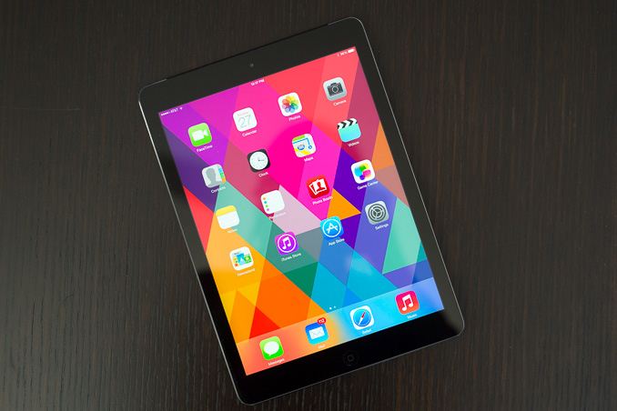
It seemed like a foregone conclusion that the 10-inch tablet market was done for, with all interest and excitement shifting to smaller, but equally capable 7 or 8-inch tablets instead. It also seemed like 15-inch notebook computers were done for a couple of years ago, then Apple launched the MacBook Pro with Retina Display. In a similar vein, last week Apple introduced the iPad Air.
A significant re-imagining of the original 9.7-inch iPad, the Air breathes new life into the platform. Much like the rMBP, the iPad Air borrows a lot of the learnings from its more popular ultraportable counterpart. I don’t know that it will curb enthusiasm over the iPad mini, particularly now that the new mini shares the same hardware platform (including display), but it levels the playing field between the two models.
Trying to summarize what makes the iPad Air special quickly turns into a list of the things Apple likes to have with any evolution of an existing product: it’s smaller, lighter and faster with absolutely no tradeoffs made in the process. The iPad Air feels like a true successor to the iPad 2. If we look at a table charting the progression of physical specs that argument seems even more credible:
| iPad Dimensions/Weight Comparison | |||||||
| iPad | iPad 2 | iPad 3 | iPad 4 | iPad Air | |||
| Height | 243 mm | 241 mm | 241 mm | 241 mm | 240 mm | ||
| Width | 190 mm | 186 mm | 186 mm | 186 mm | 170 mm | ||
| Thickness | 13.4 mm | 8.8 mm | 9.4 mm | 9.4 mm | 7.5 mm | ||
| Weight | 680 g | 601 g | 650 g | 650 g | 469 g | ||
The iPad Air shrinks all dimensions compared to its predecessors, and in some cases does so quite substantially. The best example I have is actually this shot of the iPad 4 resting on top of the iPad Air:

iPad 4 (top) vs. iPad Air (bottom)
The overhang measures nearly an inch, yet the iPad Air features the same 9.7-inch display as its predecessor. Lower power components inside helped reduce the need for a huge battery. The iPad Air moves back down to a more reasonable sized battery (32.4Wh), compared to the downright notebook-sized 42Wh battery from the 3rd and 4th generation iPads. The Air still has a bigger battery than the iPad 2, but the device is still lighter. The smaller battery frees up a lot of internal volume, which allowed Apple to compress the big iPad without shrinking display size.
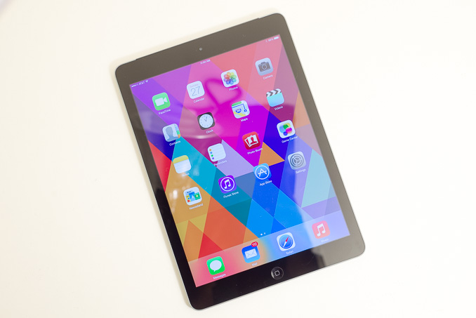
The visual tradeoff was the same as what we saw with the iPad mini: the iPad Air forgoes a uniform bezel around its display for an uneven design. There’s a rather thick bezel at the top and the bottom, and a narrower bezel along the left and right edges. The whole thing now looks like a bigger iPad mini, rather than a completely unrelated device.
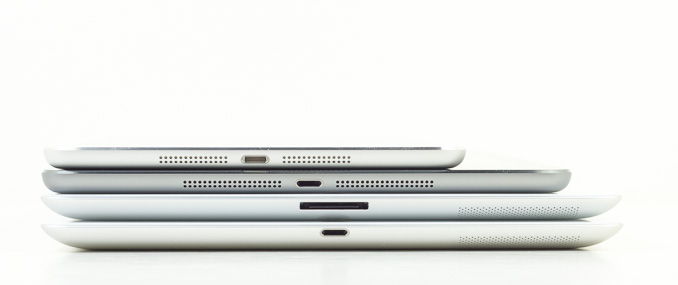
From top to bottom: iPad mini, iPad Air, iPad 2, iPad 4
The thinner bezel around the left/right edges doesn’t pose a problem for using the device. Just as with the iPad mini, Apple does a good job of rejecting your thumbs while they’re resting on the edges of the capacitive display. Sometimes it’s a bit too good of a job as it’ll reject the beginnings of my thumb placement if I'm trying to casually swipe between web pages in mobile Safari, but for the most part it’s seamless and well done. Despite the thinner bezels, you can still use the iPad Air just like you would any prior iPad.
The weight of the iPad Air does its name justice. Without any covers attached the iPad Air weighs an even pound. Even the LTE version tips the scales at just 1.05 lbs. I weighed my LTE review sample at 474 grams, that’s still a lot compared to a 7 or 8-inch tablet, but compared to the 3rd and 4th gen iPads it’s a huge improvement.
The iPad was never light enough for me to comfortably hold in my hands, suspended above my face while lying in bed or on the couch for long periods of time. The iPad 2 got close, but the 3rd and 4th generation iPads reset the scale completely. That’s actually one reason why I liked the iPad mini and Nexus 7 so much, they were far more comfortable to hold.
The iPad Air gets incredibly close. Sans case, the iPad Air is light enough that I can comfortably hold it above me (with two hands) for a while without my wrists getting tired. I still prefer propping the iPad up against something but I think 1 pound may be the crossover point for me personally. With a Smart Cover attached the Air is still passable, it’s only with the Smart Case that I feel like the combination gets a bit too heavy to hold without resting against something for extended use.
One handed use, holding the Air above my face for long periods of time is still tough to do. I always have to prop it up against something rather than hold it like I would a paperback book or magazine. Literally all other use cases however are near perfect with the iPad Air: holding it in two hands, resting it against my palm, looking down at it, suspending it in front of me, or propping it up against my chest/legs. With just a little bit of support, the iPad Air’s perceived weight quickly diminishes to what feels like nothing.
I’ll always take lighter, but the iPad Air strikes a good balance between weight and material quality. There really isn’t another tablet of this size that feels anywhere near as good.
Apple’s insistence on marrying glass and aluminum continues to work, as the iPad Air looks great. The new thinner bezel brings a modern feel to the front, continuing throughout the rest of the device. You now get the same diamond-cut chamfered edges from the iPhone 5/5s and the iPad mini, and the same subtle curve around the sides rather than the steep rake from the iPad 4.
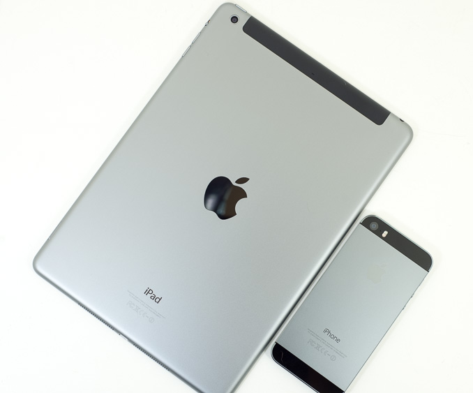
Color options remain at two: space grey and silver. Gold isn’t an option on either the iPad Air or iPad mini with Retina Display. The Air’s space grey looks identical to the finish on the space grey iPhone 5s, although the texture of the two is appreciably different.
I’ve been obsessed with devices that convey the sort of lightweight yet high quality computing slate feel that I always imagined tablets could be. The list of devices that achieves that goal in my mind is pretty limited. The iPad mini did it, as did the 2013 Nexus 7. The iPad Air joins those two in a major way. In fact it’s the first tablet of this size to really feel right. The first iPad looked great but needed improvement on so many vectors. The second gave us a size and weight reduction but lost some of the luxury feel in the process. We know the story of numbers 3 and 4 which amounted to a set of tradeoffs in order to accommodate a Retina Display, but with the iPad Air Apple hits a balance of features, design and ergonomics that I don’t think we’ve ever seen in the iPad.
Hardware
| iPad Specification Comparison | ||||||||
| Apple iPad Air | Apple iPad 4 | Apple iPad 3 | Apple iPad 2 | Apple iPad | ||||
| Dimensions | 240 x 170 x 7.5 mm | 241.2 x 185.7 x 9.4mm | 241.2 x 185.7 x 9.4mm | 241.2 x 185.7 x 8.8mm | 243.0 x 190.0 x 13.4mm | |||
| Display | 9.7-inch 2048 x 1536 IPS | 9.7-inch 2048 x 1536 IPS | 9.7-inch 2048 x 1536 IPS | 9.7-inch 1024 x 768 IPS | 9.7-inch 1024 x 768 IPS | |||
| Weight | 469g (WiFi) | 652g (WiFi) | 652g (WiFi) | 601g (WiFi) | 680g (WiFi) | |||
| Processor | Apple A7 (2 x Cyclone 1.4GHz, PowerVR G6430) |
Apple A6X (2 x Swift, PowerVR SGX 554MP4) |
Apple A5X (2 x Cortex A9, PowerVR SGX 543MP4) |
1GHz Apple A5 (2 x Cortex A9, PowerVR SGX543MP2) | 1GHz Apple A4 (1 x Cortex A8, PowerVR SGX 535) | |||
| Connectivity | WiFi , Optional 4G LTE | WiFi , Optional 4G LTE | WiFi , Optional 4G LTE | WiFi , Optional 3G | WiFi , Optional 3G | |||
| Memory | 1GB | 1GB | 1GB | 512MB | 256MB | |||
| Storage | 16GB—128GB | 16GB—128GB | 16GB—64GB | 16GB—64GB | 16GB—64GB | |||
| Battery | 32.4Wh | 42.5Wh | 42.5Wh | 25Wh | 25Wh | |||
| Starting Price | $499 | - | - | $399 | - | |||
Like the mini, the iPad Air gets two speakers that flank the Lightning connector along the bottom edge of the tablet held in portrait mode. Speaker quality is good, especially considering how thin the device is. Lower frequencies played back at high volumes send notable vibrations through the aluminum chassis, but otherwise the sound reproduction is loud, crisp and generally high quality.

iPad 4 (top) vs. iPad Air (bottom)
In portrait mode, separation between the two speakers is great enough that you do get a stereo effect. Even lightly resting the Air against your body, blocking the speaker grills, doesn’t substantially impact sound quality. In landscape, there’s no getting around the fact that you only have speakers on one side of the device unfortunately. Speaker placement is a tough thing to get right on a tablet. Put them on the sides of a tablet and you potentially hurt portrait use. Pick the top/bottom for speaker placement and you do the same for landscape use. Given the iPad’s 4:3 aspect ratio, there’s a clear optimization for portrait mode. That combined with the plastic RF window along the top to accommodate the cellular antenna on LTE models leaves one location for the speakers.
Up top you’ll find a power/lock button, headphone jack, and for the first time, two microphones. Along the right side you’ll find individual volume up/down buttons, a rotation lock/mute switch and on cellular models a nano SIM card tray. All of the buttons feel clicky and high quality.

iPad 4 (top) vs. iPad Air (bottom)
Neither the iPad Air nor the new iPad mini with Retina Display feature Apple’s Touch ID fingerprint sensor that debuted with the iPhone 5s. Both instead use the same home button as on previous iPads. The absence of Touch ID isn’t a huge issue on a tablet, especially given the vast difference in usage models between a tablet and a phone. My guess is you’re far more likely to repeatedly lock/unlock your phone than a tablet. That’s not to say that Touch ID wouldn’t be useful on the iPad Air. Not having to type in a long password to authenticate with the App Store would be nice, although I’m wondering if Apple would have to reconsider some of the timing limitations on how frequently you need to authenticate to avoid having to manually type in your password. Touch ID on the iPad Air wouldn’t necessarily be a simple port over, but my guess is it didn’t make the cut due to component availability more than anything else.
Pricing on the iPad Air hasn’t changed at all. The entry level model comes with 16GB of storage and WiFi for $499. Each capacity upgrade sets you back another $100, while adding cellular connectivity to any model drives the price up $130.
An interesting side effect of Apple’s pricing structure is that the cost for NAND upgrades actually gets pretty reasonable at the higher capacities. It’s the lower capacities that are the most expensive to upgrade (e.g. moving from 16GB to 32GB will cost you $6.25 per extra GB of storage, downright enterprise NAND pricing, but going from 64GB to 128GB costs you another $1.56 per extra GB).
Cases
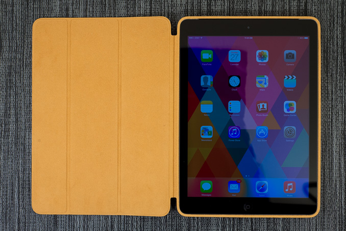
The iPad Air’s new dimensions require new cases. Apple updated both of its iPad cases to support the iPad Air. First off is the new $39 Smart Cover.
Apple originally introduced the Smart Cover alongside the iPad 2. Magnets inside the iPad and inside the case attract one another and make getting in/out of the case very quick. I never really appreciated the flexibility of being able to quickly detach the Smart Cover before, but given how light the iPad Air is now I found myself taking the cover off when using the iPad for a long period of time and just quickly re-attaching it before putting the tablet down or going somewhere.
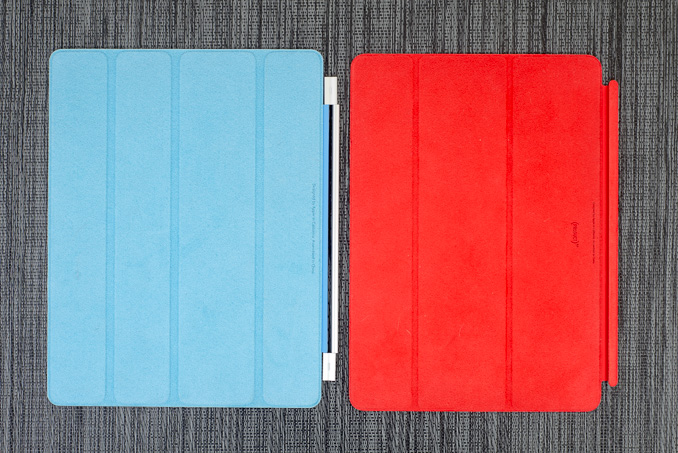
1st gen smart cover (left) vs. iPad Air smart cover (right)
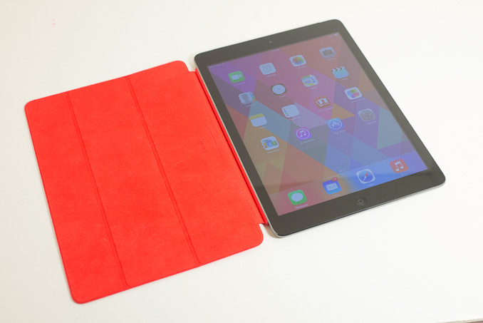
The new Smart Cover moves to a 3-fold design similar to the iPad mini’s Smart Cover. The cover is now all a single piece instead of the more complicated hinge design we saw with the original Smart Cover. The magnets handle alignment incredibly well. Just bring the Smart Cover close to the left edge of the iPad Air and let physics go to work. I don’t know if the strength/size of the magnets inside the cover have changed at all, but the lighter weight of the iPad Air makes it much easier for the cover to support the weight of the iPad if you happen to pick the device up by its attached Smart Cover. It’s not as strong as the connection between a Surface and one of its covers, and you can still get the two to separate if you swing the tablet around, but it’s a far more stable connection than in any of the previous iPads.
Magnets in the opposite end of the Smart Cover are still not strong enough to prevent it from flopping down when flipped around the back of the iPad Air.
Apple also relies on the magnets inside the Smart Cover to sleep/wake the iPad Air. By default, closing the cover will put the device to sleep. Similarly, pulling the cover away from the display wakes it up.
You can still use the Smart Cover as a makeshift stand for the iPad by folding it up. The new design means the iPad stands at a wider angle than with the previous design, tilting the display further away from you when the iPad is fully upright. For desk use I like the new angle, but if you’re using your chest as a prop for the tablet it’s arguably worse. Thankfully the iPad Air is so much lighter than its predecessor that it’s still more comfortable to use lying down, even if you have to partially support the weight of the iPad with your hands.
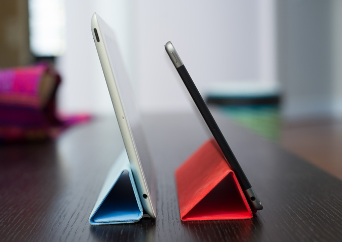
iPad 4 + Smart Cover (left) vs. iPad Air + Smart Cover (right)
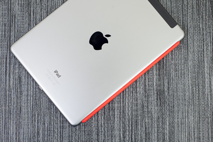
The inside surface of the Smart Cover is still made out of microfiber which attempts to help keep your display clean when closed. The outside surface is a soft touch polyurethane. Smart Covers are available in six colors. Apple sampled me a Product Red cover, which I thought was a great fit for the space grey iPad Air.
While the Smart Cover offers screen protection, Apple offers a $79 leather Smart Case that protects all surfaces of the iPad Air. The inside of the case is still microfiber, and you still get the auto lock/unlock features of the Smart Cover. The cover flap also doubles as a stand.
The new Smart Case feel great and seem to do a good job of protecting the iPad Air. The leather feels smooth and doesn’t seem to have the durability issues of the new iPhone 5s leather cases.
Getting the iPad out of the Smart Case does take a little more time as you have to pull it out of a relatively tight tub, so I wouldn’t recommend it as an option if you’re looking to constantly get in/out of the case. There is a more noticeable weight penalty from using the Smart Case as well. As I mentioned before, the iPad Air is light enough that the addition of any case can have a substantial impact on the feel.
Both of the first party case options work really well. The only thing that Apple doesn’t make for the iPad is a case that incorporates a keyboard, although I’m not sure that iOS is in dire need of a physical keyboard either. I can definitely appreciate a convertible/2-in-1, but I’m just not sure iOS is the right platform for such a thing.






444 Comments
View All Comments
over9k - Tuesday, October 29, 2013 - link
Two paragraphs in and this is already better than all the other "reviews" out there.Beautyspin - Tuesday, October 29, 2013 - link
You should not really call any review by Anandtech of Apple products as reviews. They are homages paid to their shrine. This is a ritual with them..Drumsticks - Tuesday, October 29, 2013 - link
I always hear people complaining about bias here and elsewhere for apple products. But what exactly is the reason for that? The majority of the review is seriously objective - you can't argue that apple has some of the best performance in he game right now, and the best display to boot. He only thing rivaling it is probably the higher clocked Z3770, while Qualcomm will probably pass Apple's GPU early next year.as far as subjectivity goes, even if you don't like the design, the materials are solid. And it manages to be lighter than every other ten inch tablet on the market (and thinner) withot sacrificing battery life. The only subjective things I could possibly see are maybe the sound quality and the OS itself, of which he criticized a few times. Where does the bias come in?
Fleeb - Tuesday, October 29, 2013 - link
"and the best display to boot"We have yet to wait for the Kindle HDX review but it is lighter, packs more pixels and with 100%RGB gamut.
darwinosx - Wednesday, October 30, 2013 - link
Its lighter because it is cheap plastic. It is also a far more limited device. Really laughable to think it compares to an Air.dsumanik - Wednesday, October 30, 2013 - link
Read this review with a grain of salt. Anand lai shimpi is heavenly vested in apple stock, doing everything he can to boost the dismal situation.Thinner bezels and light weight do not hide the fact that functionally, this iPad is the same as the previous 2 generations.
Sent from my ipad3, which will be upgraded when apple actually updates the product line.
Here's some basic ideas mr cook:
Wireless charging
Fingerprint scanner
Thunderbolt sync or usb3
Haptic feedback
NFC
John2k13 - Wednesday, October 30, 2013 - link
You know what's disgusting about your comment, and those similar to yours? That you basically accuse the author of being a liar, a shill, and completely lacking in integrity- without a shred of evidence. I read the entire 10 page review, and it was incredibly detailed, precise, and well-written, something that would be obvious to most sane, rational, objective people."Anand lai shimpi is heavenly vested in apple stock, doing everything he can to boost the dismal situation."
First of all, what "dismal situation"? Apple stock is up around $130 from a few months ago, or almost a third. Hardly "dismal". Also, do you think a single review from a website visited primarily by tech geeks is going to have any fucking effect on the stock? I mean, are you for real? Don't assume the author holds the same amount of ignorant stupidity that you apparently do, to think for a second this review would have a snowball's chance in hell in affecting stock. You clearly know nothing about how the financial market works.
"Thinner bezels and light weight do not hide the fact that functionally, this iPad is the same as the previous 2 generations."
Functionality on a tablet is primarily based on software, and the iPad has 475,000+ optimized apps which are getting more powerful all the time. The hardware simply enables better software. A tablet is basically a blank slate for the software, and better hardware helps in enabling better software. Every single aspect of this iPad is improved, so yes, it is more "functional". That list you made, though, is pretty ridiculous, and obviously a desperate attempt to list anything you can think of that the iPad doesn't have and pretend its significant.
Wireless charging- why? This makes the device more functional, how?
Fingerprint scanner- Wow, brilliant "idea". You probably mocked touch ID when it appeared on the 5S. Again, this would be nice to have I guess, but in no way impedes "functionality" of the tablet.
Thunderbolt sync or usb3- I have no idea what "thunderbolt sync" means, and its pretty ridiculous you're harping on a USB3 port. It will never happen, nor should it.
Haptic feedback- Utterly useless gimmick, but heym why not, right?
NFC- I have NFC on my Nexus 4, and not ONCE have I even run into an opportunity or a reason to use it. But yeah, I'm sure you honestly think it's needed or useful on an iPad. Again, another meaningless bulletpoint you were desperate to add mindlessly.
Next time you want to baselessly accuse an author of being a liar, a shill, a sellout, and having no honesty or integrity, try to make a coherent post that actually contains some intelligent, well thought out information. Otherwise, by attacking the author you just embarrass yourself as you did now. Grow up.
ABR - Wednesday, October 30, 2013 - link
Actually thunderbolt sync is one of the changes I'm really waiting for. Have you ever tried restoring even a 16GB iPad over USB? Slow agony. I can't even imagine what someone w/a 64 or 128GB model must go through. Even ordinary everyday syncs are far slower than what they could or should be.Howard Ellacott - Wednesday, October 30, 2013 - link
You clearly don't realise what thunderbolt is, which is why that's such a stupid suggestion. Yes, faster syncs would be amazing, and restoring a 64gb iPhone is a right pain, but thunderbolt isn't the way.Kristian Vättö - Wednesday, October 30, 2013 - link
USB 2.0 isn't the real bottleneck there, it's NAND. Most eMMC solutions can't even saturate the USB 2.0 link with sequential writes, so Thunderbolt or USB 3.0 would do absolutely.