The Windows RT Review
by Vivek Gowri & Anand Lal Shimpi on October 25, 2012 12:00 PM EST- Posted in
- Windows RT
- Operating Systems
- Microsoft
- Mobile
- Windows 8
- Tablets
User Interface, Gestures, and Multitasking
by Anand Shimpi and Vivek Gowri
By now you should be fairly familiar with what Windows RT’s Start Screen looks like, at least from a distance. Power on a Windows RT tablet and you’ll be greeted by the new Windows UI. A big, horizontal canvas full of live tiles, a feature that first debuted in Windows Phone 7. Based on the Metro design language, and referred to as Metro UI for much of the development cycle, a trademark dispute has forced a name change to Modern UI. There’s no getting around it, there’s a definite learning curve to the interface. It doesn’t matter if you’re used to Windows 7, OS X, Android or iOS, the touch enabled Windows RT UI is going to feel different, and probably downright wrong...at first.
If you put in the time to learn and get used to the interface however, it is easily among the best tablet user interfaces I’ve ever tried. Everything we despise Windows 8 for on the desktop makes perfect sense when viewed through tablet colored glasses.
As a recap, Windows RT (and Windows 8) relies on edge swipe gestures for much of the macro control over navigation. Full screen apps are left purposefully barren, with their focus primarily on content. The power is in what lies (virtually) beyond the edges of the screen.
There’s no capacitive sensor array in the bezel of a Windows RT tablet, instead what the touch controller does is looks at starting position and velocity of gesture to determine whether your swipe originated on or off screen.
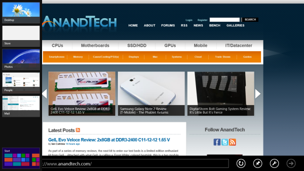
There are only four edge swipes you need to learn, one for each edge of the display. Swipe in from the left and you flip through apps, giving Microsoft the win for quickest task switcher among all tablets. By default a left edge swipe will switch to the previously used app, or if you just switched from that it’ll move to the next most-recently used app.
If you have a lot of apps to switch between simply left edge swipe in partially then swipe back out, revealing a more traditional task switcher (Windows + Tab also brings up this switcher). Of all of the Windows RT gestures the swipe in/out to bring up the task switcher is the most clunky, but it’s easy to get used to.
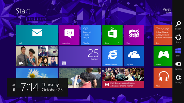
Go to the opposite side of the screen and right edge swipe in to reveal the charms bar. Here you get direct access to the software start button as well as a bunch of key tools, among them are search and settings.
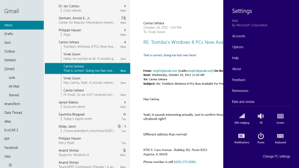
Although the appearance of the charms bar never changes, the function of these buttons do. Start always takes you to the start screen, but search and settings apply to the app currently in focus. I can’t stress how much of an advantage this is over iOS. If I need to play with an app setting on the iPad I either need to go home and to settings then find the app or hope the developer has stuck a tab somewhere in the app where I can play with options.
Even better is the fact that I can toggle things like an app’s ability to run in the background and whether or not it’s allowed to give me notifications on the lock screen directly from the app settings page. The icing on the cake? Playing with settings never forces me out of the app itself, Windows RT simply devotes the right 1/4 of the screen to settings, leaving my app still in focus on the left. It’s perfect.
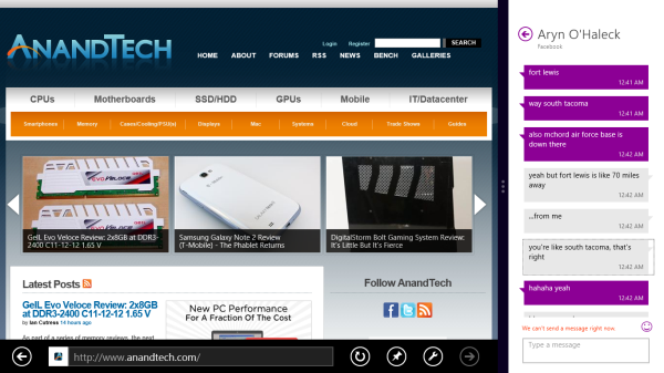
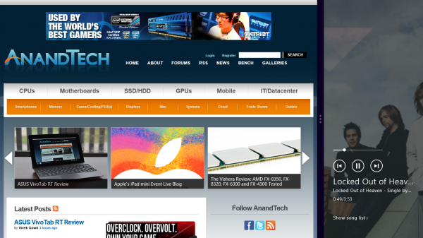
Also perfect? The ability to snap applications to the right or left edge of the screen and have a different window open in the remaining portion. This was called Metro Snap before use of the Metro name was discontinued, and it’s one of the more interesting features here. Snapping requires a screen with at least 1366 horizontal pixels, allocated as 1024 to the main window, 22 to the splitter, and 320 to the snapped application panel. It’s great for having an IM conversation or email inbox open on the side when writing, browsing, or doing essentially anything else.
One of the biggest issues I’ve had with tablet multitasking to date is that it’s all been very focused on the active window, which makes doing things like messaging an absolute pain because you’re continually flipping between whatever you were doing (let’s say browsing the web) and the messaging application. In Windows RT though, you just snap the conversation window to the side and continue browsing, just with a narrower browser window.
Messaging is just one usecase though - email, Facebook, Twitter, Skype video calls (their implementation is pretty cool - more on this later), music, a small browser window docked on the edge while writing in the main screen, the possibilities are endless. You could even theoretically turn it into three near-equal size windows using Aero Snap in Windows desktop, though that severely cuts down on usable space. But generally, the Snap feature gives the end user a lot of flexibility and makes multitasking a lot easier.
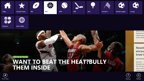
Top and bottom edge swipes end up being more application specific. Swipe up from the bottom and you usually get some additional options, while swiping down from the top edge is usually more of a navigational tool (e.g. showing multiple tabs in IE10).
Although Windows RT borrows from its iOS and Android brethren in that it will automatically pause and unload unused apps from memory, you can always manually move the process along by edge swiping down from the top and dragging the window off the bottom of the screen. This also works from the task switcher on the left side, drag over and down to the bottom of the screen to close. There’s some built in lag to ensure that you don’t accidentally quit something of importance but otherwise it works fine.
Overall, the edge swipe gestures take some getting used to but once you’ve made it over the hump they really unlock a totally new level of tablet usage.
I believe Microsoft is on to something real here with the new Windows UI for tablets. This new OS feels ahead of the curve on major issues like multitasking, task switching and displaying multiple apps on the screen at the same time. I was always told that marketshare is lost and gained in periods of transition. Microsoft missed the first major transition to new ARM based smartphones and tablets, but it’s perfectly positioned to ride the wave to notebook/tablet convergence. In fact, when it comes to figuring out how to merge those two platforms I don’t believe Apple or Google have a reasonable solution at this point. In Apple’s world the two are distinctly separate, while Google is arguably even worse off as it doesn’t have a good notebook OS at this point (the verdict is still out on Chrome OS, as promising as the new Samsung Chromebook appears to be). It’s unclear how big this convertible/hybrid market will grow, but I see real potential here. There are users who want an iPad and I don’t believe Microsoft does anything to change their minds. The iPad and iOS remain a very polished, very accessible platform that is really optimized for content consumption and light productivity. For anyone who wanted more however, there’s now an alternative: Windows RT.


_575px.png)


233 Comments
View All Comments
steven75 - Friday, November 2, 2012 - link
Huge problem. Windows 8 x86 != Windows RT compatible version.There's basically no reason to make Metro apps if you already have a working x86 app unless RT is some kind of phenomenon.
Oxford Guy - Thursday, October 25, 2012 - link
horrifyinghttp://images.anandtech.com/doci/6392/Music-Sideba...
http://images.anandtech.com/doci/6392/Screenshot%2...
http://images.anandtech.com/doci/6392/Charms.png
bad
http://images.anandtech.com/doci/6392/TaskSwitcher...
Sharp edges everywhere. Playskool colors without the roundness that makes Playskool stuff far less wretched. Misdirection aplenty.
No way. Sticking with iOS.
Oxford Guy - Thursday, October 25, 2012 - link
I think that third pic should be called the schizophrenia design language.kyuu - Thursday, October 25, 2012 - link
... Are you talking about the *background*? You're seriously going to leverage a complaint about the OS based on the *background image*?Wow.
Oxford Guy - Thursday, October 25, 2012 - link
I am not just talking about the background.kyuu - Thursday, October 25, 2012 - link
Lol.Aesthetics are, of course, completely subjective, but complaining about Metro/Modern-UI while sticking with the chiclets-on-a-grid iOS just seems silly to me.
Oxford Guy - Thursday, October 25, 2012 - link
Aesthetics is not an area that is anywhere near being completely subjective. For instance, eye tracking research has found that men look at crotches and women don't. There is a lot of psychology involved in designing an attractive and usable interface. Unfortunately, a lot of designers think aesthetics is a more subjective field than it is. Many think, erroneously, that what works well on paper works well on the screen, too.Those photos present clutter, disorder, sharp edges, and other unpleasant design attributes. The giant sharp-edged colored box look that's so prevalent is jarring, unpleasant, and unfortunate.
iOS's chiclets, at least, have softer more humanized edges and adequate space between. The soft rippled background on my iPhone 5 is also more humane than the schizoid gizmo look.
If you think aesthetics is totally subjective, explain why Microsoft Bob didn't succeed. Why don't all our computers look like THAT?
ludikraut - Friday, October 26, 2012 - link
I guess that must make me a schizo then, since I disagree with all of your points.l8r)
Dorek - Friday, November 2, 2012 - link
What, are you worried you'll cut yourself?Devo2007 - Thursday, October 25, 2012 - link
"Swipe in from the left and you flip through apps, giving Microsoft the win for quickest task switcher among all tablets"While it's not iOS or Android, the BlackBerry PlayBook can swipe through apps by swiping in from the left or right. So in this case, I'd call it a tie.