The iPhone 5 Display: Thoroughly Analyzed
by Chris Heinonen on September 27, 2012 12:00 AM ESTWhen Apple rolled out the iPhone 5, they announced that it had a full sRGB gamut, which the new iPad almost achieves and would be a substantial improvement over the 4 and 4S displays. The slight increase in screen resolution and size means we are looking at a new panel than the previous generations used as well, with the new panel being speced at 800:1 contrast ratio and 500 nits of brightness. I don’t have a 4S to test, but used my iPhone 4 that was bought on launch day and has been in use since then for comparison. Numbers were run using CalMAN 5 software, and a SpectraCal C6 colorimeter that was profiled from an i1Pro spectrometer. All readings are the average of three measurements from the C6, except for very dark readings where ten measurements were taken for more accuracy.
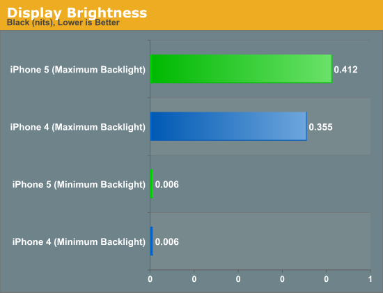
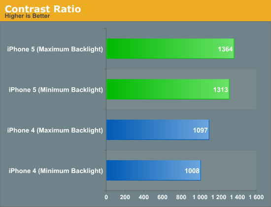
For comparing the minimum black and white levels in the iPhone 4 and 5, I set the brightness to the minimum level where I could get a reading from a black screen. At the minimum value I couldn’t get any reading, which indicates that it’s below the 0.001 threshhold that the C6 is capable of reading. Both phones had a minimum black level reading of 0.006 nits, but the iPhone 4 had a white level of 5.669 nits compared to the iPhone 5 and its reading of 8.303 nits. This gives us contrast ratios of 1008:1 for the iPhone 4 and 1313:1 for the iPhone 5. Both are ahead of the specified numbers, but the iPhone 5 is clearly better here.
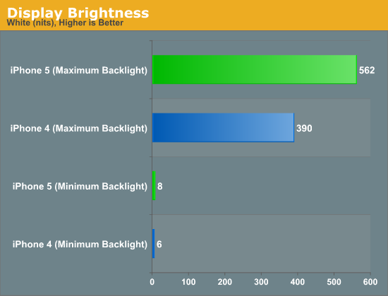
At maximum brightness, the iPhone 4 has a maximum white output of 390 nits, and the iPhone 5 clearly trumps that with 562 nits. The backlight of the iPhone 4 could have become slightly dimmer over time, but using LEDs it really should not have faded much. Black levels for the phones are 0.355 for the iPhone 4 and 0.412 for the iPhone 5. This gives us contrast ratios of 1097:1 for the iPhone 4 and 1364:1 for the iPhone 5. Clearly contrast levels have been improved here, despite the move to a larger screen that sometimes can affect them.
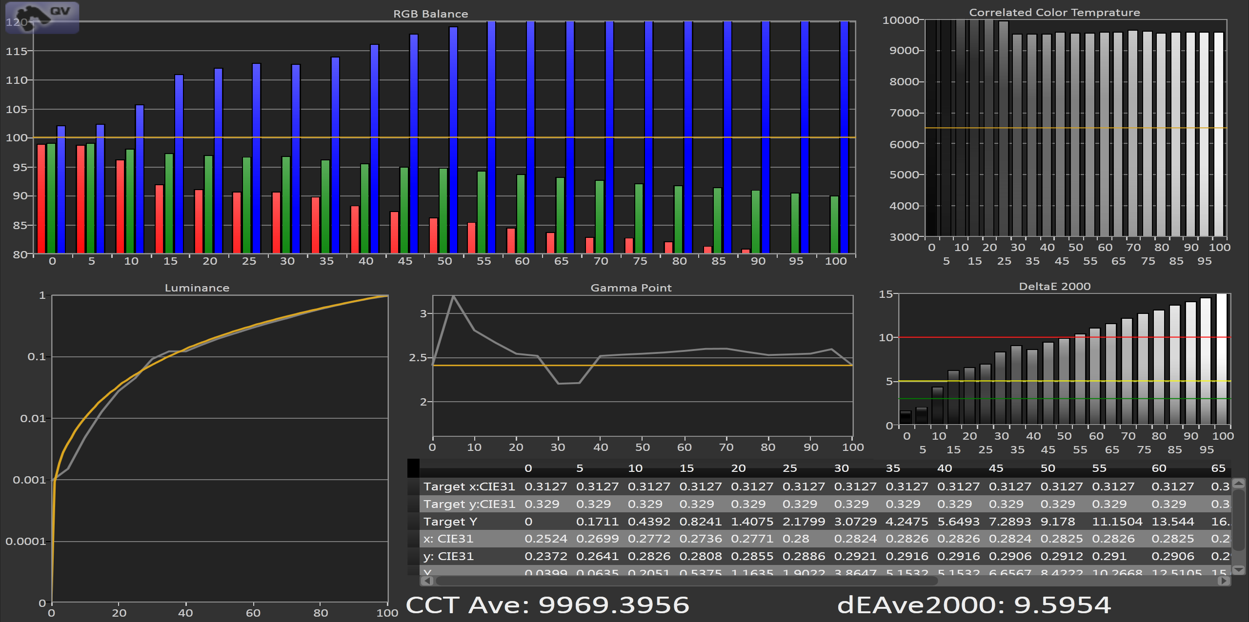
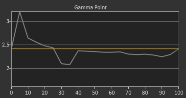
Looking at the grayscale, the iPhone 4 puts out an average dE2000 of almost 10 across the spectrum. The grayscale has a very noticeable blue shift that can be seen in the numbers, and a CCT that is close to 10000K and not the 6500K that is the sRGB standard. The gamma also shows a clear spike at the bottom when we target the sRGB gamma curve. If we target a gamma of 2.2 that spike goes away, as the sRGB gamma is linear at the bottom end. Overall the grayscale of the iPhone 4 would be rated as very poor if it was a desktop display or a television.


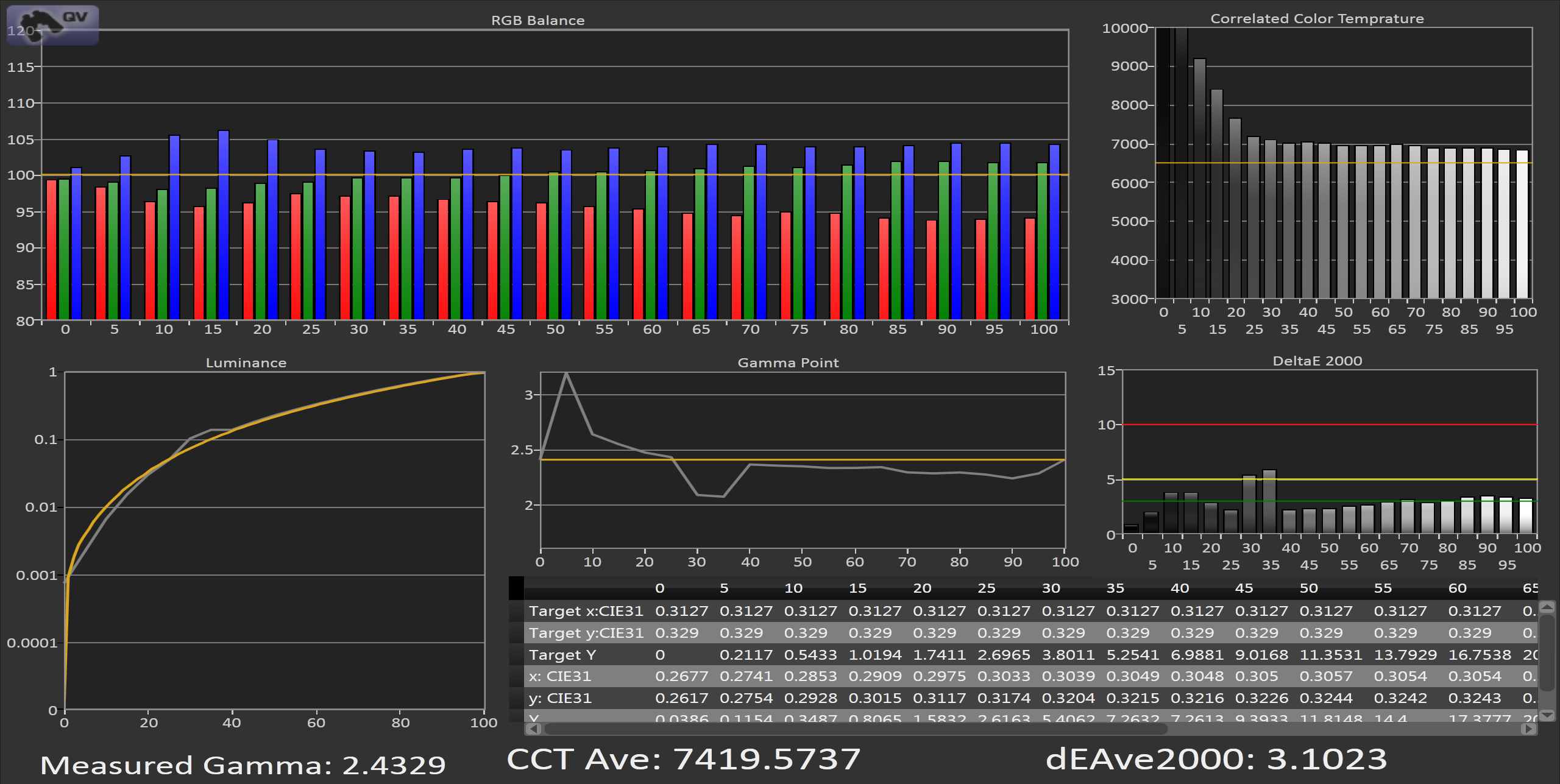
Looking at the iPhone 5, we see a totally different story. There is still a lack of red in the grayscale, but it’s much lower and the average dE2000 is a very respectable 3.1 across the spectrum. The gamma is again targeting 2.2 instead of sRGB which you can notice at the bottom end, but other than a couple outlier numbers at 30 and 35% stimulus, we have a grayscale that is almost entirely below the visible error line on the chart.


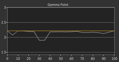
If I change the Gamma target to 2.2 from sRGB, you can see that the line is much flatter across the spectrum and that bump at 5% is eliminated. Since Apple uses 2.2 as the default target gamma on their computers and not the sRGB standard, I'm not too surprised to see that their phone would also target 2.2 as well.
sRGB Gamma Target
2.2 Gamma Target
Overall the grayscale performance of the iPhone 5 is outstanding, and a world ahead of the iPhone 4 in performance.
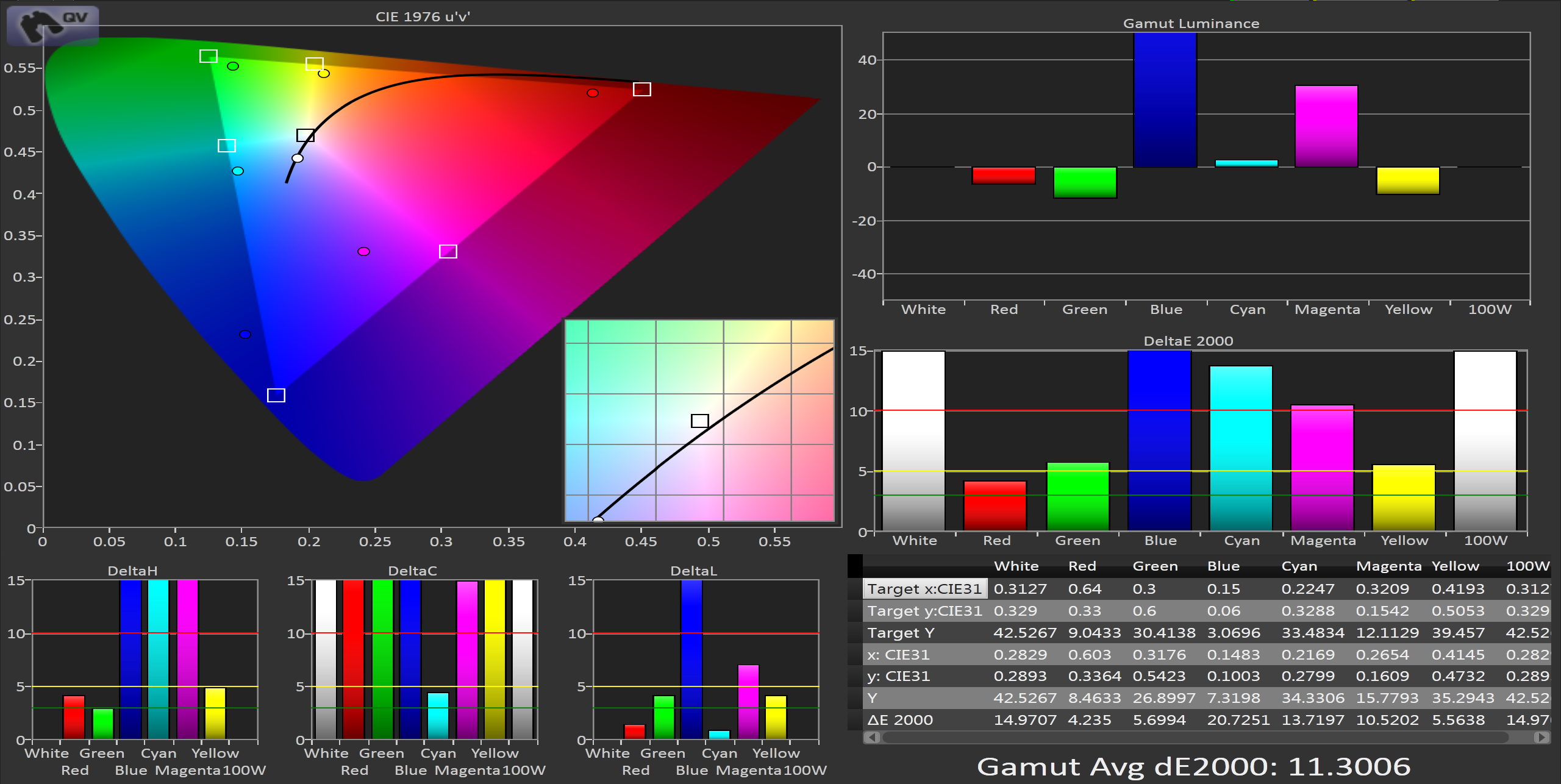
Moving onto the color gamut, on the iPhone 4 using the CIE 1976 uv chart, we see that we clearly lack full saturation in Red, Green, and Blue in the color gamut, which leads to the secondaries also being under-saturated. Our dE2000 numbers are low for green and red, but blue is over 20 and pushes our average dE2000 over 11. This gives us errors that are clearly visible in normal use and means that many colors that fall inside of the sRGB gamut will not be rendered correctly as we can’t display the full area.


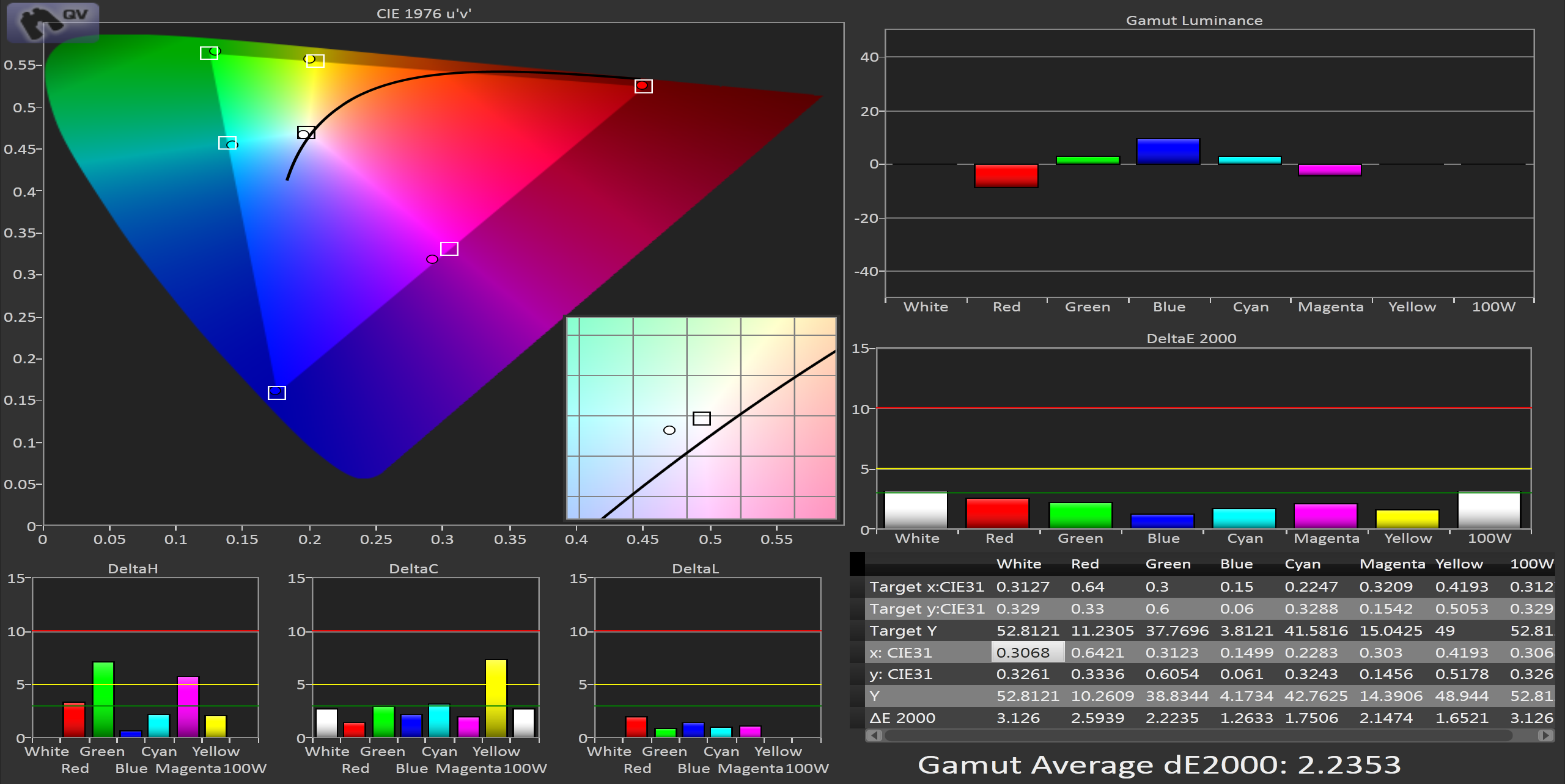
In contrast to this, the iPhone 5 covers almost the entire gamut. Red, Green, and Blue all have dE2000 values of 2.6 or less, and the average dE2000 value is 2.2, for a fantastic result. Unlike the charts for the iPhone 4 where not all of the data was visible, here we just see very small errors across the spectrum, with no individual dE component being higher than 8.


This improvement is very easy to notice on the iPhone 5 even without running numbers. Colors like the yellow in the eBay app icon are much more vivid and saturated than before, and blues have far more shades available than previously. The entire sRGB gamut is now available on the iPhone 5 and the result is outstanding.
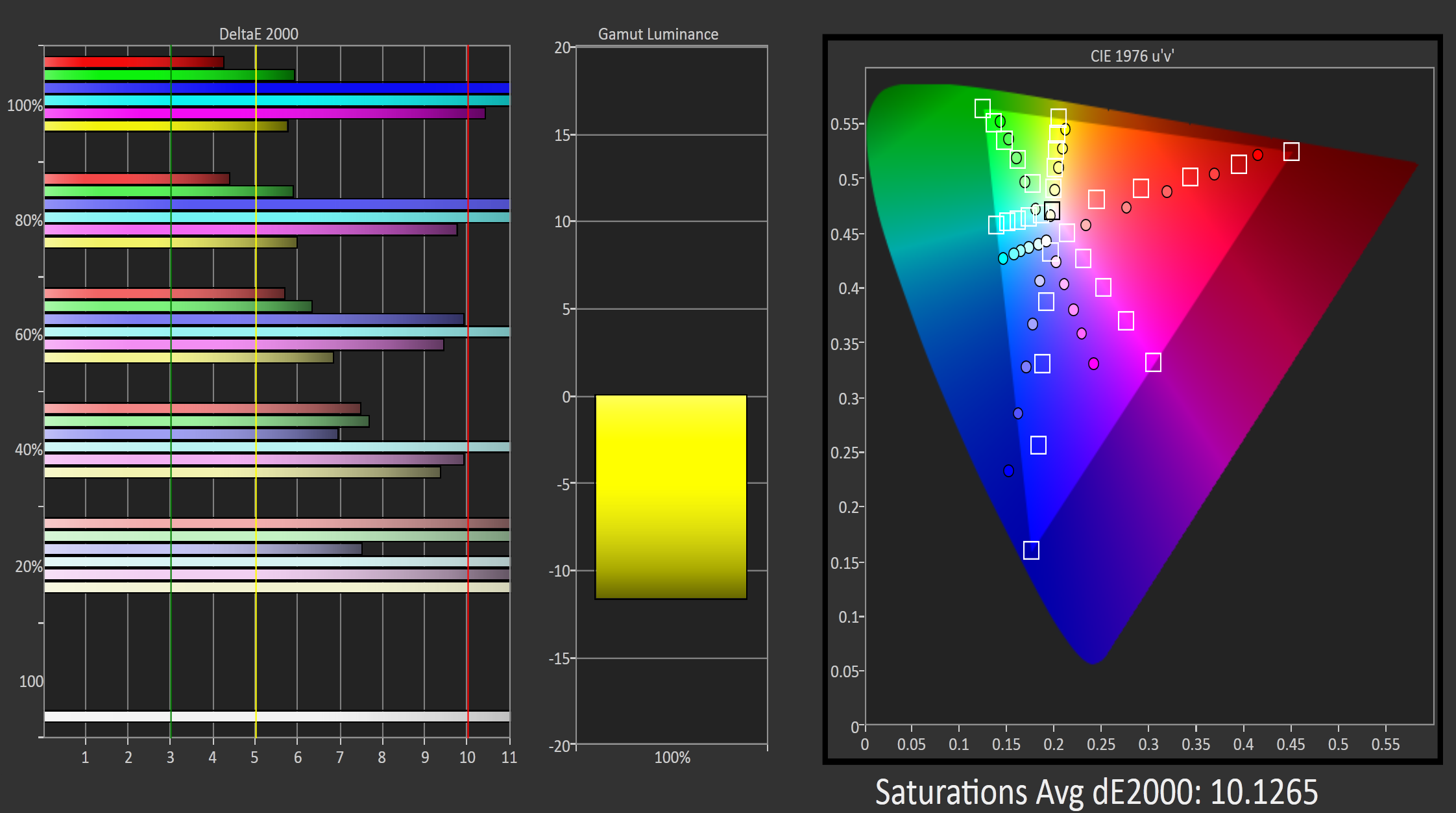
Measuring how the phone handles saturations is another important step. While we know the iPhone 5 can reach the full saturations for each color, how well can it render those saturations that are less than 100%? Looking at the iPhone 4 quickly, we see that with its under-saturated gamut, we have very high dE2000 numbers across the board. Even lower saturations are way off the target and have high numbers. In the end this is better than those being accurate, as then anything beyond what the iPhone could display would be rendered identically so 60% blue and 100% blue would look the same, instead of both having errors that make them distinct to the eye. Of course this doesn’t excuse having an error over 10 across the whole spectrum, but that’s the choice that was made with the screens at the time.


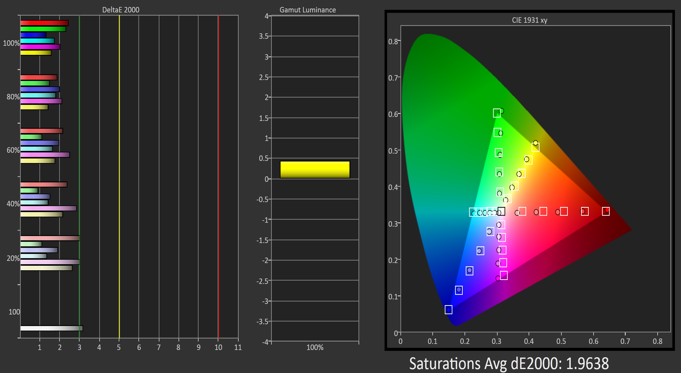
Now looking at the iPhone 5, our numbers are even better than on the straight gamut charts. The average dE2000 drops below 2, and no single reading extends beyond 3 except for white. Across the whole spectrum of colors on the iPhone 5 you can expect accurate, well saturated colors that will look as accurate as they would on a reasonably calibrated desktop IPS display. I would be quite happy if desktop monitors and TVs were shipped this accurate.


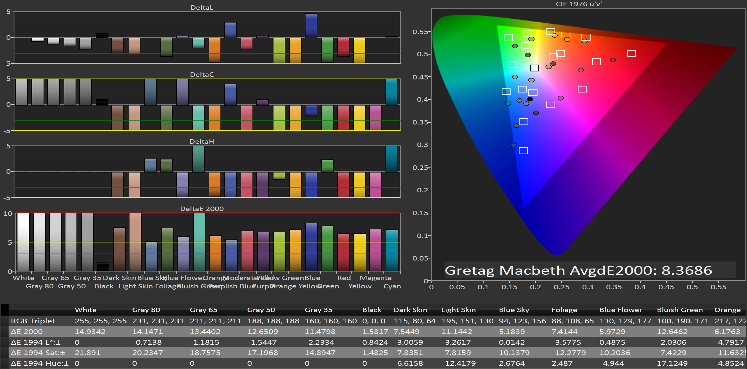
Finally I now have the ability to run the Gretag Macbeth color checker chart on a phone to see how well they perform with non-primary and secondary colors. Since the iPhone 4 has such an under-saturated gamut, we would expect it to have a large error on the Gretag Macbeth chart and we are correct. The average dE2000 is over 8, and many of the numbers are off the charts. The only color without a visible error (below the yellow line) is black, and that really would be awful if black had a visible error. Overall the performance here is pretty mediocre, though somewhat in line with computer monitors as they are shipped to consumers.


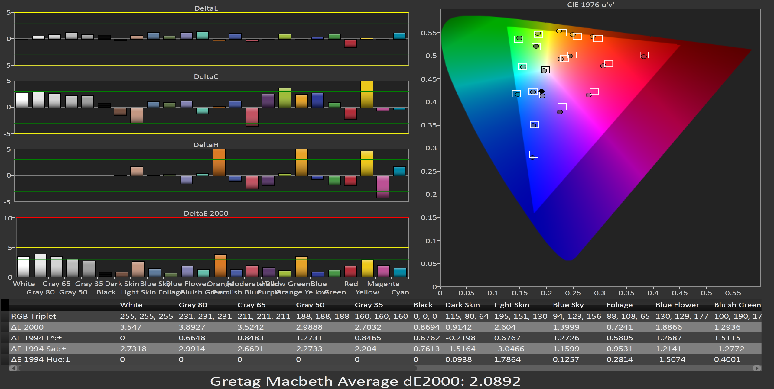
With the iPhone 5, we see an average dE2000 of only 2.09, which would make it the best LCD monitor I would have reviewed at AnandTech to this point (in terms of out-of-the-box performance). Only a couple shades of orange creep above the green error line, and nothing moves above the yellow line that would make it clearly visible to a user. Every color point at least comes close to hitting its target, and there are no errors that are excessive or that you will notice even during color critical use.


Wrapping up, the iPhone 5 display is a quantum leap better than the display on the iPhone 4. Contrast levels and light output have both been increased, and color performance is astonishing. The full sRGB gamut is present here, and color errors are remarkably low even for a high end desktop display. While many were hoping for a move to OLED or some other screen innovation, this really is a huge step up that is very easy to quantify. To put this in perspective, in the past few years I've reviewed probably 30-40 different displays, from PC monitors to TVs to projectors. Not a single one, out of the box, can put up the Gretag Macbeth dE numbers that the iPhone can, and perhaps one projector (which listed for $20,000) can approach the grayscale and color accuracy out of the box.
Apple obviously has very high control over what parts they use and what comes off their assembly lines. I don't know if they are having the displays individually adjusted after they are assembled, or if the quality control is very strict, or if I just got a remarkably lucky sample. I do know that if TV and PC Monitor vendors were able to provide displays that looked like this out of the box, professional calibrators would lose a good amount of business. The new panel in the iPhone 5 is simply remarkable in quality and if it were a PC monitor, I'd give it a Gold Award on the basis of its performance.


100 Comments
View All Comments
amdwilliam1985 - Friday, September 28, 2012 - link
thank you for your reply, it gave me hope that i'm not the only person who dislike like apple and reads anandtech.back to the topic, i agree with most of your points. forget the lab result, most people i know prefers my "fake" and over saturated color in galaxy s phone over their stale/washed out color in iphones. show them the same movie played with galaxy s phone and in iphone and anyone who isn't.blind will pick galaxy s phone due to the amazing true black colors.
don't worry about iphone's temp dominance, people will see its boriness and move on. i used to own an 3gs, it was one of the best phone at its time, but all recent ones are just plan boring. i recently travelled to hong kong, at least half of the population has moved on from iphones. wonder where samsung got their 10 million galaxy note sale? look at hong kong, there's gotta be 3 millions on the street at any given moment, not kidding. just take a peak in their subway. they have 3g signal in the subway, which helps to pointing to their large screens for viewing pleasures.
also back in the usa, i used to see all my friends with iphone, then i started using the first non-iphone, and now there are a quarter of us using galaxy phones. i believe the tread will continue.
when i saw anandtech tech's more than 2x performance increase from 4s to 5, i was impressed. but after seeing 4s and 5 side by side in real life test, no one i know can tell a difference. i was embarassed by my friend who ask me to show the improvement (in real life task) and i can't.
here's another sign of apple losing dominance, my girlfriend, she used to be a die hard iphone user, having used 3gs, 4 and 4s. when she saw what iphone 5 did. she said 4s will be her last iphone. she's looking at galaxy note series, the s pen is the deciding factor.
by the way, i am still in hong kong, and for the past 2 days, i saw telecomm stores selling galaxy note 2. at first i thought it was fake chinese knock offs. because i didn't see any usa news agency covering it, the earliest note 2 sale date is october 1st in uk. i played with note 2 in a few stores and i am convinced it's real. jelly bean, s pen and model number n7100 are the hints.
sorry for the spelling mistakes and grammar, i typed this entire post on my galaxy s3.
Zink - Thursday, September 27, 2012 - link
Why is this iPhone 4 so much dimmer than theirs?cheinonen - Thursday, September 27, 2012 - link
It could be a sample difference, or age, but that is what mine measured on maximum brightness with Auto Backlight turned off. I used the same patterns for each phone, copied straight from Dropbox into the Photos application.zanon - Thursday, September 27, 2012 - link
Chris, thank you very much for the pithy yet thorough review. It's genuinely heartening to see the march of display improvements continue after so many years of relative stagnation, and I hope to see that extend to both notebooks and desktops sooner rather then later. First we saw high DPI, the most immediately obvious and natural physical boost to a screen. With that "done" (further improvements face diminishing returns) actual screen quality (gamut, contrast etc) is the next obvious step, but one I wasn't sure would actually happen. I'm glad the work was put into this display, and that AT is here to investigate it.Regarding blue though:
Sounds like the backlighting is standard gallium-nitride LED tech. The emission spectrum there, even with standard phosphor, has a extremely strong blue spike with the phosphor then showing a smear across the rest, with a bit of a hump around yellow-green IIRC. Tighter band filtering improves gamut, but it also means more light thrown away (which in turn means heat and wasted power). It'll probably take some more basic level changes to take it any farther, either via specific OLEDs or GaN modifiers like Nanosys' proposed quantum dot films. I'll be looking forward to seeing what Apple and other players choose to go with next in the 2013/2014 revisions of their displays, and I hope it spreads everywhere sooner rather then later. Really exciting stuff.
Long term of course some sort of HUD tech is probably the end game and the next disruptor, but it'll be quite a while before good old flat panels go away even then.
cheinonen - Thursday, September 27, 2012 - link
A blue shift is very common in displays, from TVs that you buy to computer monitors. When viewed alone, and not beside an actual calibrated display, the presence of blue makes the display appear to be brighter and whites to be whiter, though they are actually blue tinted. All vendors have the ability to make a display that doesn't have a blue tint to it, but they often choose not to because to the average consumer, it's going to stand out more and most people have no idea what a calibrated, neutral image would look like.I'd really like to get a display that is this well adjusted, but OLED based (and RGB OLED, not Pentile) as you can have the true, infinite contrast ratios as well as the accurate colors. The issue is that most people shipping OLED displays right now are blowing out the colors to make them appear really vibrant because they can, and there is no real way to adjust them back to being nice and natural looking.
EnzoFX - Thursday, September 27, 2012 - link
I too am glad for the push, and that Apple is leading the way in Smartphones. I can't help but think this kind of tech pushes they do is to keep their profit margins heh. Otherwise, other phone manufacturers wouldn't do it, because they can't rely on those margins.This push however does seem to be lead in the smartphone space. Take Retina, it is just now trickling to laptops. It'll be a while until we see it on Desktops, granted this is due to yields, so maybe not a good example.
piroroadkill - Thursday, September 27, 2012 - link
"I'd give it a Gold Award on the basis of it's performance"basis of it is performance? Fails to make sense..
cheinonen - Thursday, September 27, 2012 - link
Not factoring in other things, such as price, ergonomics, inputs, input lag, and other things that would merit consideration for a desktop LCD. Just on performance alone, it would be Gold level quality is what I am trying to convey.solipsism - Thursday, September 27, 2012 - link
He's annoyingly stating how it's (it is) should be replaced with its.ssiu - Thursday, September 27, 2012 - link
I wonder if iPod Touch 5 really has an identical display as iPhone 5, or will it be inferior in some yet-to-be-clarified way.