Amazon Kindle Fire Review
by Anand Lal Shimpi & Vivek Gowri on November 29, 2011 3:31 AM EST- Posted in
- Tablets
- Mobile
- Amazon
- Kindle Fire
- Kindle
Mario Twins
Rumor had it that in order to save time (and likely cost) in bringing the Fire to market, Amazon had opted to use the same design as the BlackBerry PlayBook courtesy of the ODM that made both: Quanta.
ODMs like Quanta will build anything you want or they'll do slight modifications to an existing design to suit your needs. The idea is you don't need to be an expert at everything. If your differentiation is primarily software and you just need a fast hardware platform, Quanta (or Pegasus or Foxconn, etc...) will give you that and let you roll your own software stack on top of it. It's not all that uncommon in the industry. This is actually how companies like Marvell work in the SSD space as well. They'll give you the hardware, but the most successful drive makers simply use the Marvell hardware as a base platform - they all write their own firmware.
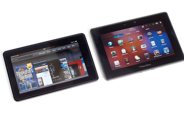
Aesthetically, the Kindle Fire looks a lot like the PlayBook. The dimensions, screen size/resolution and even build quality are eerily reminiscent of one another although the PlayBook is tangibly larger. Both tablets have a large screen bezel (the PB's is bigger) and soft touch plastic on the back. The power/lock button on the Kindle Fire is also quite similar to what's used on the PlayBook. It's in a different location and is much easier to actuate but it's clear that even the buttons came from a similar parts bin.
A look inside both devices shows a different arrangement of components and a different layout on each motherboard. Our own Brian Klug spotted a curious reference on each board however: the PlayBook's board is labeled Rev. G while the Fire's board is labeled Rev. F. Is it possible that the two boards are simply different revisions of one another?
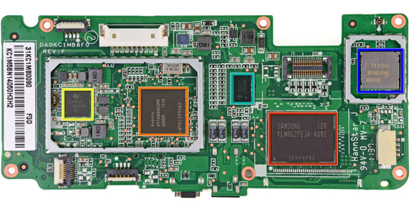
Image Courtesy iFixit - Kindle Fire Motherboard
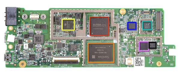
Image Courtesy iFixit - Kindle Fire Motherboard
Either way it's clear Amazon departed from its usual unique design approach with the Kindle Fire. While previous Kindles were fairly recognizable among a sea of devices, the Kindle Fire looks and feels like a PlayBook. In fact, when it's off and sitting on your desk, you'd be hard pressed to tell that it was something made by Amazon. The large 'kindle' lettering on the back was likely designed to address this brand identity issue, but it really was the only thing Amazon could have done given the generic looking platform.
Looks aren't a major concern of mine but I do wonder what we can conclude from this. Either the Kindle Fire was a rushed project to catch the 2011 holiday shopping season or it's a sign that value tablets can't look very special, or perhaps both?
Simplicity in Hardware
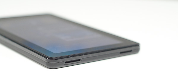
Despite the physical similarities to the PlayBook, Amazon whittled down the number of buttons on the Kindle Fire to just one: power/lock. Volume controls are entirely in software, and to be honest I don't miss the physical buttons. As this isn't a smartphone, I don't need to worry about quickly silencing a ring or increasing the volume of a call. The tradeoff here makes sense.
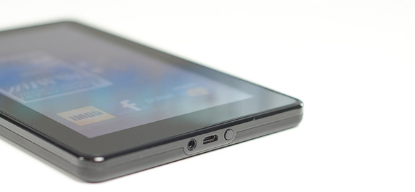
As I mentioned before, the round power/lock button is easy to actuate. The bigger problem is the button's location: at the bottom of the Kindle Fire. On the bright side it does keep the button out of your way when you're reading, it just happens to be in the exact opposite location of where years of using modern smartphones/tablets have taught us to expect it. Then again, an oddly placed power/lock button isn't too big of a deal when you've got a configurable software screen lock.
A 1/8-inch headphone jack and micro USB port keep the power/lock button company. Amazon doesn't ship the fire with a micro USB cable, instead you just get a power brick with a micro USB end for charging the Fire. To Amazon's credit, to use the Fire as a Kindle you never need to hook it up to your Mac or PC. A standard USB cable is only really needed for getting your own music, videos or apps onto the device.
There are a pair of stereo speakers on the opposite end of the device. The volume control feels non-linear and the speakers get loud enough to make their position a bit awkward. Hearing loud noises from one side of the device and not the other isn't really desirable, particularly since you'll likely be watching movies on the Kindle Fire in landscape mode.




70 Comments
View All Comments
doobydoo - Thursday, December 8, 2011 - link
Who buys both an iPad AND an Android tablet, particularly given your irrational dislike for tablets?Very ignorant comments you make.
Kindle Fire IS trying to accomplish some of the same tasks that the iPad does. Eg web browsing - the key part of functionality in the iPad.
The probem is, it does it worse, because it is too small.
iPad and droid tablets are not trying to accomplish what 'laptops do well', at all. They are alternative, lightweight and more simple alternatives when it comes to accessing the web and apps, predominantly. And they do that exceptionally well. There are millions of people who bought them with realistic expectations and therefore kept them, only people with illogical hopes such as the tablet being a work-computer replacement would come away disappointed, and I would be curious which part they didn't realise would happen before they bought?
If anything is a 'tweener' - it's this Kindle Fire. It does the web / app thing - badly. It does the book thing - badly. It's an attempt to combine the best of both worlds, jack of all trades, master of none kind of story.
Which explains why it's cheap.
As for knocking Apple for bringing out devices in 6-12 months (when they have an annual so clearly not a 6 month life-cycle) - how ironic? Lets look at the Kindle release path:
Kindle 2 - Feb 10th, 2009
Kindle DX - July 1st, 2010
Kindle 3rd Gen - July 28th, 2010
Kindle 4th Gen - Sep 28th, 2011
Just over 2 years, 4 products. Ironic much?
It isn't just Apple fanboys who appreciate the use of tablets - it's just people who aren't so ridiculously stupid that they expect a tablet to be a PC. They know what it is, realise its place, and benefit from it enormously.
haukionkannel - Tuesday, November 29, 2011 - link
Well, I am more of e-ink friend because I wan to read books form my tablet. But the option to read allso net pages would be nice, so I am really much vaiting for coulour e-inks displays!They are stin under development, but offer superior display quality over LCD dispays. The problem is speed, so no fast games to colour e-ink, but the consume very little power and offer cood readability to the text!
RandomUsername3245 - Tuesday, November 29, 2011 - link
About 12 months ago I held a prototype color eInk touchscreen display after a talk by an eInk Corporation employee. It was quite impressive, but the color isn't quite up to glossy magazine / photograph quality, and, like you said, it ran at about 12 frames per second.e-Ink consumes power only when switching pages, so when it starts to run at higher frame rates it becomes much less efficient. e-Ink is great when you switch pages every few seconds when reading a page of text, but if you were asking it to play 10 fps animation or support quick-refresh page scrolling, I don't think it would offer much benefit over LCD.
NorthstarNerd - Tuesday, November 29, 2011 - link
I own both an iPad 1 and a Kindle Fire. Both are good products, but different. I'm amazed how much my Fire can do at $300 less than an iPad. Having said that I HATE the Amazon Carousel, and quickly learned how to get rid of it w/o rooting the device!http://www.northstarnerd.org/econtent/2011/11/pers...
genomecop - Thursday, December 1, 2011 - link
No problem on the install, but Kindle Books wont launch from Go Launcher.PeteH - Thursday, December 8, 2011 - link
Keep in mind the iPad is a previous generation of hardware, and I think it's a little misleading to compare the price points and capabilities of products from different generations. Newer generations of technology always do more for less money.adamantinepiggy - Tuesday, November 29, 2011 - link
Hand the Fire to anyone who has never played with one. First thing they invariably do is bump the power button with their hand. Rest the device against your chest (like when you are reading lying down), 1st thing that happens is power button gets bumped. Look at it wrong and I swear the power button gets bumped by ocular telekinesis magic. Yes you could flip the thing upside down, but having to perform tablet acrobatic to compensate for a crappy layout is stupid.It seems not one single person bothered to QA the button design when all that was needed was to move it, or cheaper still, make it recessed or much stiffer.
Stuffster - Tuesday, November 29, 2011 - link
This review has almost everything I could ask for. But it's missing one of the most important questions I have: what about privacy?How effectively can I use the Fire as an e-reader without providing any personal information - for example, can I just provide a username, password, and something like a one-time-use credit card?
Smartphones, tablets, and e-readers aren't exactly friendly in this regard. I'd love for reviews of these devices to include a page dedicated to the matter of privacy.
cbdoc - Tuesday, November 29, 2011 - link
You can choose to not have your CC/account info saved on the device making one-time purchases possible.Stuffster - Tuesday, November 29, 2011 - link
That's good, but this is an Android-based device. Is it necessary to have a Google account to use it (which would mean providing your real name and birthdate, if nothing else)?