Apple iOS 5 Review
by Vivek Gowri, Andrew Cunningham, Saumitra Bhagwat & Brian Klug on October 18, 2011 3:05 AM ESTNotifications and the Notification Center
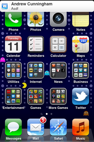
At first glance notifications on a locked iOS device appear to be simply restyled. Instead of a blue popup with white text you get a black popup with white text - and an app icon. Unlike previous versions of iOS however, multiple notifications now appear in a list on the lock screen rather than simply replacing the notification that was there previously.
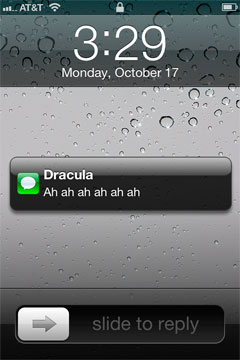
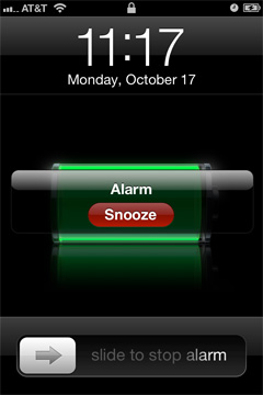
The list of notifications can get very long (we didn't test to see if it would ultimately stop, but you can now display at least 30 notifications on the lock screen) and iOS 5 allows you to scroll through them:
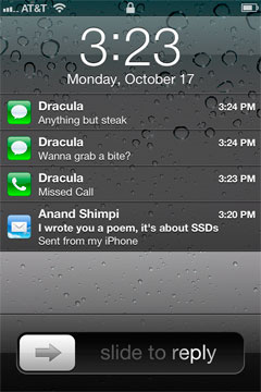

This feature alone is worth the upgrade to iOS 5 as it's a huge improvement in usability. You can now quickly get the gist of any SMS conversation and ensure there are no urgent emails that need tending to with a quick glance at your locked phone. Interacting with notifications from the lock screen is also improved, you can now slide over any notification to address it specifically:

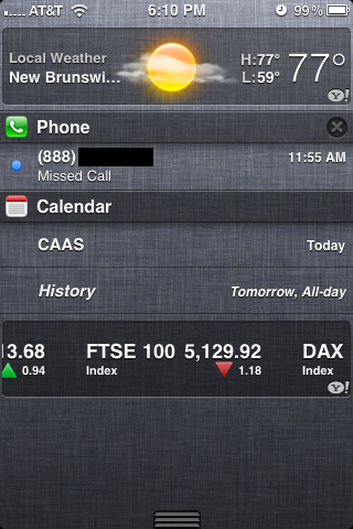
Swiping a finger down from the top of the screen reveals the new Notification Center, where your active notifications are all listed (some apps, like Weather and Stocks, can also display permanent widgets here if desired). Notifications are listed by app, and will disappear from the Notification Center once addressed or cleared manually by the user.
Pulling down the notification shade in a full screen app is a two-step process: pull once to reveal a tab and pull twice to reveal the shade. Apple does this to avoid any accidental shade activation.

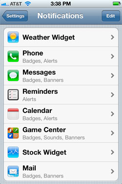
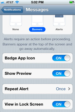
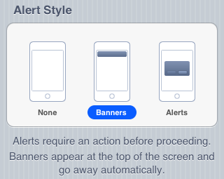
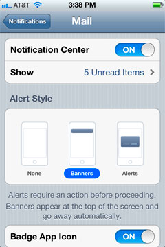
The number of notifications per app in the Notification Center is customizable:
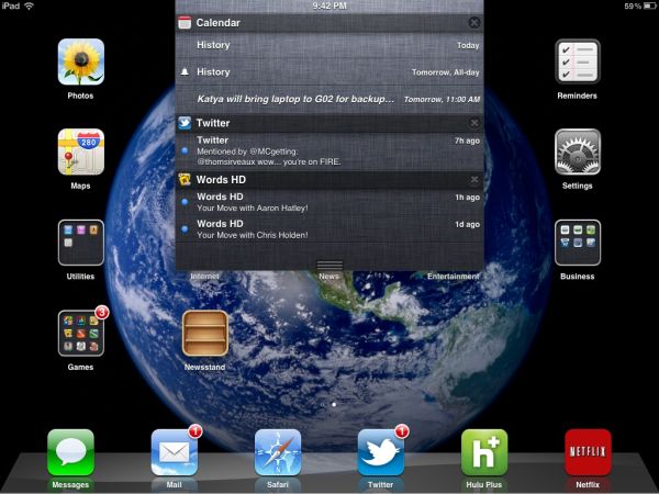
On the iPad, Notification Center works mostly like it does on the iPhone - although obviously occupying less of the screen:
The impact of the revamped notification system is arguably even more pronounced on the iPad as the previous system was a significant burden to productive use of the tablet.
The verdict? None of these features are exactly new to smartphones (Android users, especially, will note many similarities to the notifications shade) but the implementation is smooth and it really goes a long way toward making iOS more pleasant to use - the best software upgrades make you wonder how you got by without the improvements they bring, and the notification improvements achieve that goal.




86 Comments
View All Comments
myxiplx - Tuesday, October 18, 2011 - link
Just a note, my 3GS is far more responsive since installing IOS 5 than it's been for years. It's not just application launch times, popups, and notifications are a lot snappier, there's a definite reduction in the lag that's been creeping up over the last year.lurker22 - Tuesday, October 18, 2011 - link
Wow, I have found it lags a bit more than ios4kmmatney - Tuesday, October 18, 2011 - link
I'm still running iOS 4.0 (can't upgrade easily due to jailbreak for tethering) and its not all that bad once you disable Spotlight search. I'm hoping they have an untethered Jailbreak for iOS 5 soon, though.lurker22 - Tuesday, October 18, 2011 - link
Anand,Surprised you missed this large flaw. iPads will not receive iMessages sent to your cellular number, just iMessages sent to the email addresses setup in the iMessage account.
This is a huge flaw. What has already happened to me is people using their iPads have missed messages for many hours since they were addressed to the cell number and this then isn't devlivered to the iPads.
Why would apple miss this huge functionality gap? It means now I have to remember to send iMessages to email addresses to be sure the person will see it in a timely fashion.
Aikouka - Tuesday, October 18, 2011 - link
That explains why I never saw any of the "iMessages" that a friend sent me the other day. I was wondering why they didn't show up when I poked around the Messaging app on my iPad. I assumed all you had to do was sign into the same iMessage account to share everything.Brian Klug - Tuesday, October 18, 2011 - link
That's all you have to do for things to work, however there's a catch that I mention - both devices have to be configured to have the same iMessage "Caller ID." This is why the default Caller ID is set to the iMessage "Apple ID" email account, and also the other catch is that your sender has to then be talking with that contact.-Brian
windywoo - Tuesday, October 18, 2011 - link
If Apple is just now implementing features that have been around on other phones why do their products always get such high scores in reviews? Why is it acceptable for Apple to trail in features while Android handsets will be marked down if there happens to be a flicker in the animations? Don't tell me it's because Apple does it so much better because that's subjective at best, and to my mind dishonest.All the features implemented here fix major usability flaws in iOS that really contradict the general view that Apple's products are the easiest to use, but for some reason Apple has got a pass from reviewers like some favoured, hobbit haired child.
I would like to see fewer double standards. We are talking about a capitalist, profit driven corporation, I think they can stand to be handled a little less gently.
lurker22 - Tuesday, October 18, 2011 - link
Here's whyhttp://dinnerwithandroid.tumblr.com/post/115710967...
windywoo - Tuesday, October 18, 2011 - link
That article is a prime example of what I'm talking about. Subjectives passed off as objectives. Until recently the android browser was ahead in any benchmarks yet he claims it's slow. And in any case, Android gives a choice of browser if there are any rendering errors. Safari is not without its own flaws, and when it does go wrong you're stuck, because Apple doesn't allow other browsers.He finds Widgets useless, but doesn't appreciate that other people might not and Android allows them the freedom to spend battery juice on trinkets like live wallpaper if they so choose. Why is it that Apple users always consider it an advantage to have Apple make decisions for them and will pay over the odds to be nannied?
The market argument is almost entirely irrelevant. Let's leave aside the fact that he can't have looked very closely if he thinks there is no software on the Android market, the same argument used to be addressed at Macs. Apple fans would claim then that the quantity didn't matter so long as the major functions were there. Apps are a con anyway. If consumers weren't so gullible, many of them could be written as web apps, making platform irrelevant. But consumers are dumb. They like being fed nuggets of code like junk food.
He lists the good things at the end so why does he consider them less important than what he sees as faults? The answer is of course, fawning subservience to the mighty Apple.
Phynaz - Tuesday, October 18, 2011 - link
Who told you Apple doesn't allow other browsers. I've tried at least three alternatives, and my current browser is Atomic.