Apple iOS 5 Review
by Vivek Gowri, Andrew Cunningham, Saumitra Bhagwat & Brian Klug on October 18, 2011 3:05 AM ESTNotifications and the Notification Center
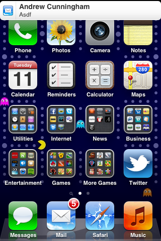
At first glance notifications on a locked iOS device appear to be simply restyled. Instead of a blue popup with white text you get a black popup with white text - and an app icon. Unlike previous versions of iOS however, multiple notifications now appear in a list on the lock screen rather than simply replacing the notification that was there previously.

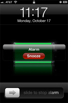
The list of notifications can get very long (we didn't test to see if it would ultimately stop, but you can now display at least 30 notifications on the lock screen) and iOS 5 allows you to scroll through them:
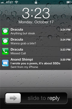

This feature alone is worth the upgrade to iOS 5 as it's a huge improvement in usability. You can now quickly get the gist of any SMS conversation and ensure there are no urgent emails that need tending to with a quick glance at your locked phone. Interacting with notifications from the lock screen is also improved, you can now slide over any notification to address it specifically:

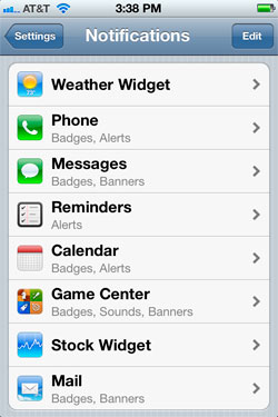
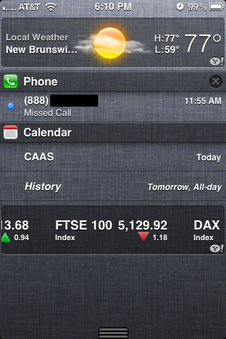
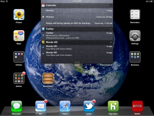
Swiping a finger down from the top of the screen reveals the new Notification Center, where your active notifications are all listed (some apps, like Weather and Stocks, can also display permanent widgets here if desired). Notifications are listed by app, and will disappear from the Notification Center once addressed or cleared manually by the user.
Pulling down the notification shade in a full screen app is a two-step process: pull once to reveal a tab and pull twice to reveal the shade. Apple does this to avoid any accidental shade activation.

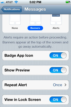
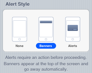
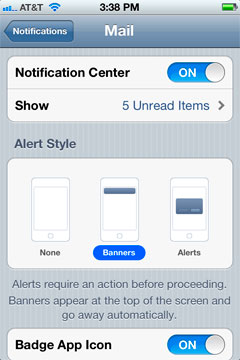
The number of notifications per app in the Notification Center is customizable:
On the iPad, Notification Center works mostly like it does on the iPhone - although obviously occupying less of the screen:
The impact of the revamped notification system is arguably even more pronounced on the iPad as the previous system was a significant burden to productive use of the tablet.
The verdict? None of these features are exactly new to smartphones (Android users, especially, will note many similarities to the notifications shade) but the implementation is smooth and it really goes a long way toward making iOS more pleasant to use - the best software upgrades make you wonder how you got by without the improvements they bring, and the notification improvements achieve that goal.




86 Comments
View All Comments
Aikouka - Tuesday, October 18, 2011 - link
Have you guys noticed any weird issues with WiFi sync? It seems that whenever I would unplug my phone, iTunes would start freaking out because it couldn't find the phone. That's pretty obvious why... it's no longer on the network since iOS only keeps WiFi alive while plugged in. It would constantly pop up an error about being unable to find my iPhone or iPad.Not to mention leaving "Open iTunes when this device is connected" would cause iTunes to constantly open up... even when closed. Turning this off caused my device to enter some weird limbo state with iTunes. Plugging it in gave me an error, "Another iPhone has sync'd with this computer." The only options were to restore or setup as a new iPhone. A little Googling revealed that the only option was to hit setup as new iPhone and quickly unplug the cable.
It worked, but now my device just comes up as "Apple iPhone" instead of how it used to.
I really don't like iTunes.
kezeka - Thursday, October 20, 2011 - link
I just straight up cannot get it to function with my iPad 2 and MBP. I have tried pretty much everything I can think of without any luck. Not that it bothers me that much, I would just like to have it working to simplify the syncing of the two.name99 - Thursday, October 20, 2011 - link
There are two things you might want to try.(a) Shame on Apple for not making this clear, but you have to go to iTunes and, while the phone is plugged in, toggle the "Sync with this phone over WiFi" checkbox. It is not set by default, and when you try to sync on your phone, the phone gives a useless error message rather than telling you this setting needs to be toggled.
(b) You have to ensure that your phone in on the correct wifi network. If you have a modern Airport base station and have a guest network setup, you must ensure that the phone is NOT on the guest network --- best is to tell the phone to forget the guest network. This makes perfect sense --- the whole point of the guest network is to contact the outside world, without allowing you to contact machines on the local LAN.
StormyParis - Tuesday, October 18, 2011 - link
Guys, I think devoting graphs to gains of 0.1s is... mmmm.... we French say "sodomozing flies". I think the coclusion is 1- don't do graphs for irrelevant sutff (especially, not lots and lots fo thm) 2- a 0.1s improvement is not forth more than a "slightly speedier" comment in passing, and 3- those times are so low to start with, lobel them "very good", and talk about some interesting ?I know benchmarking is fun and all, but we're well past the point of irrelevance.
dingetje - Tuesday, October 18, 2011 - link
hmmm we dutch say f**king Ants.it seems u french are way more pervy than us ;)
cjs150 - Tuesday, October 18, 2011 - link
In depths of northern England we go for sheep - but I think that is a lifestyle choice rather than pithy phrase describing graphs!!Samoht - Tuesday, October 18, 2011 - link
interesting.. in danish it's called flyf**king. Maybe the translation from french to danish didn't carry all the way over ? Or maybe we do not need the specifics;-)Kristian Vättö - Tuesday, October 18, 2011 - link
What they show is that there is no difference, which is kind of their point.grkhetan - Tuesday, October 18, 2011 - link
I didn't know AnandTech did software reviews... I have been coming here every day since the last 3-4 days to see the iPhone 4S review, but finally I see here is an iOS5 review. But even this was high quality as your hardware reviews are -- I love how you go into detail of everything and don't cut back on prose. With hardware your reviews are unmatched in the industry considering your technical depth.Anyway, nice review and great coverage. However, when is the iPhone 4S hardware review coming out?
Blaze-Senpai - Tuesday, October 18, 2011 - link
Go read an iPhone 4 hardware review; it's basically the same thing. The only (physical) changes are minute and you'll get different bar charts.